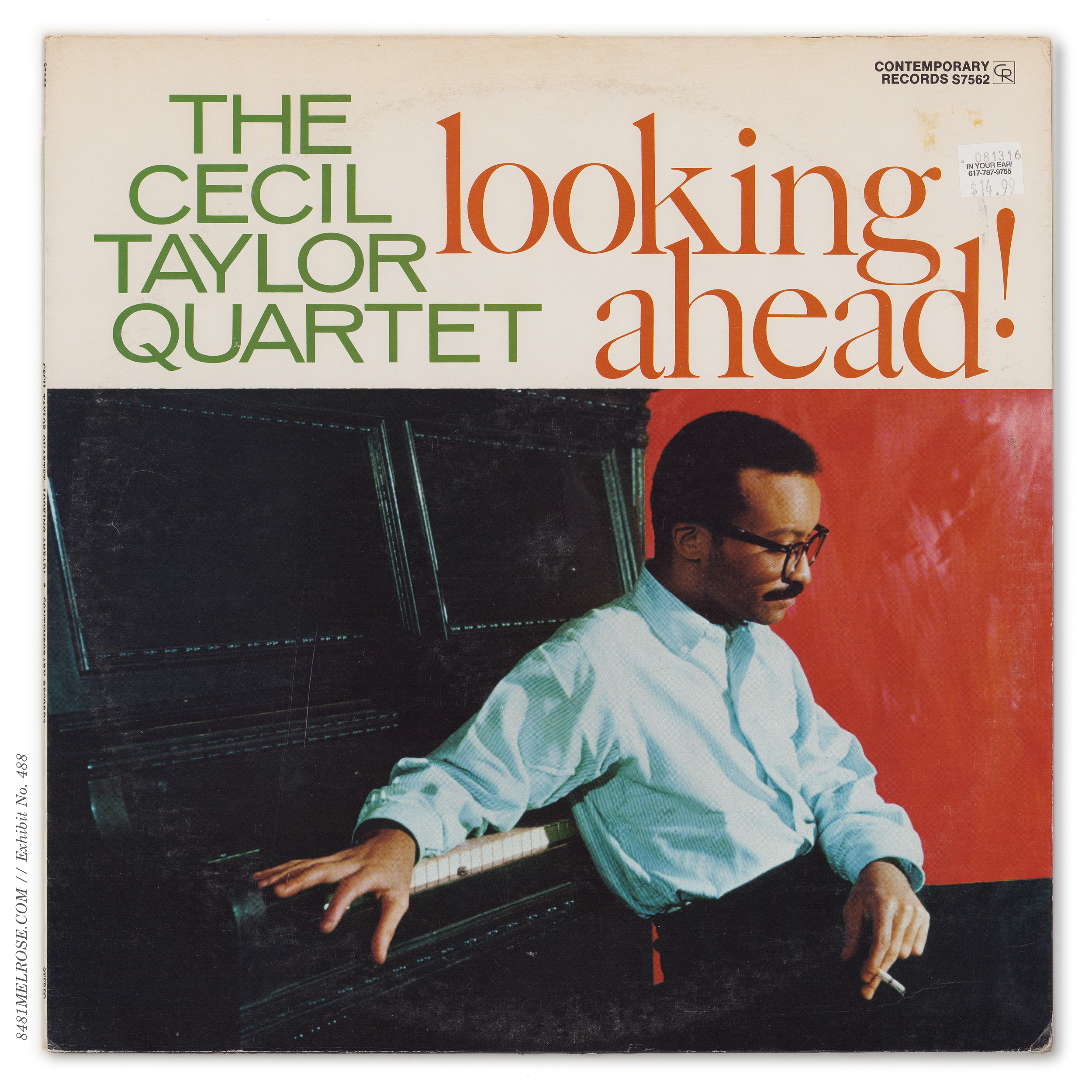
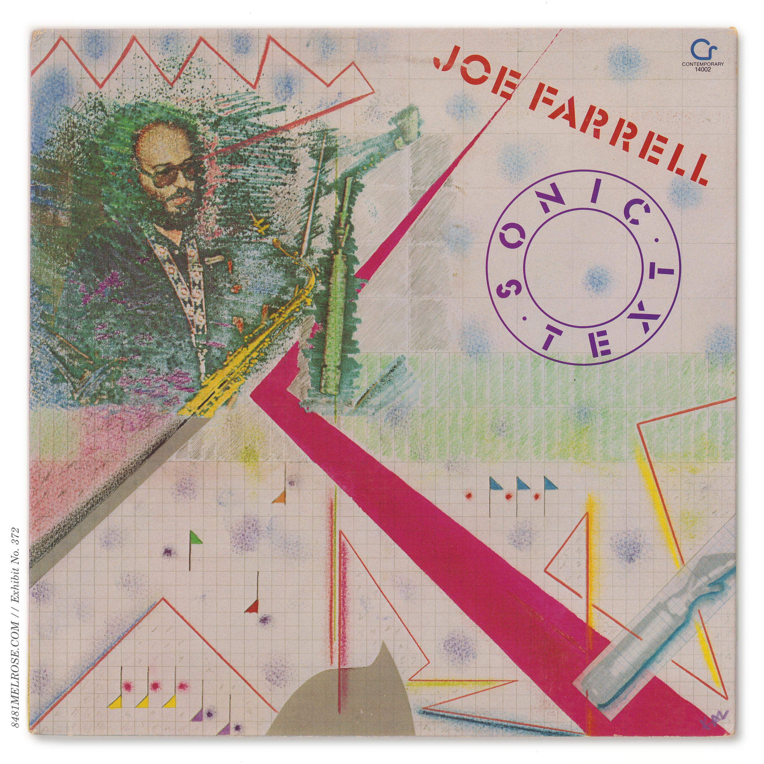
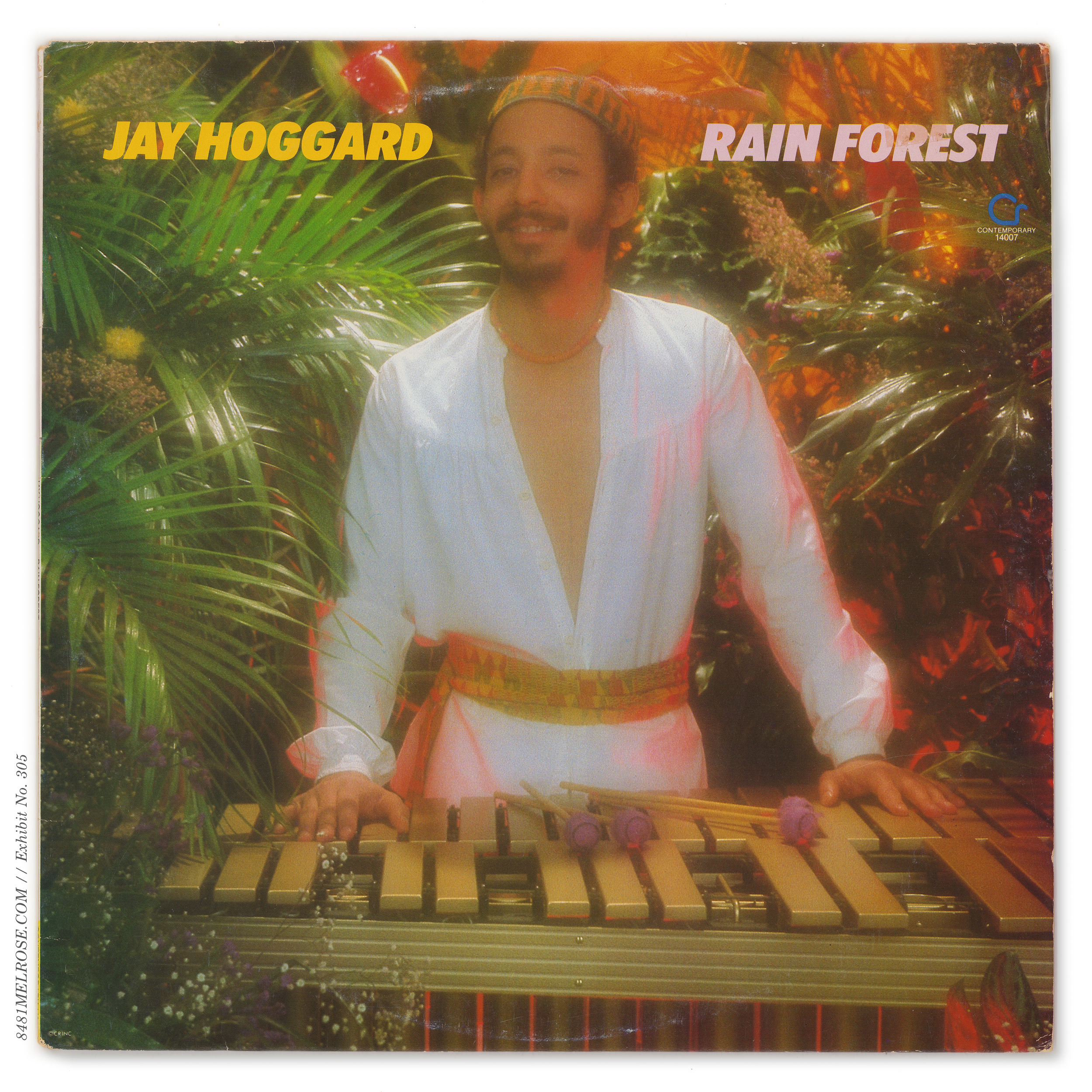
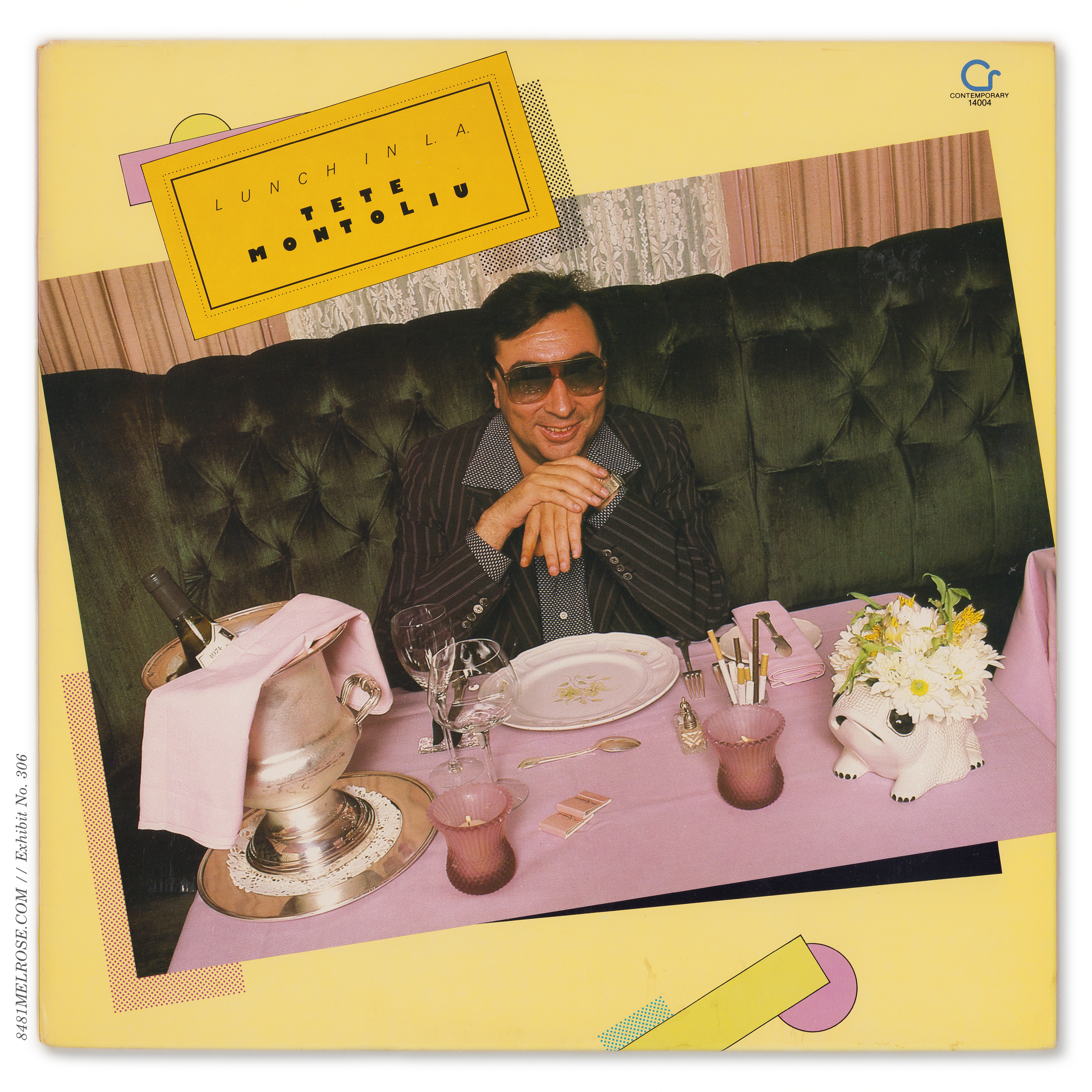
CONTEMPORARY RECORDS
jacket design
Contemporary’s jackets were beautiful, compelling, silly, and bright. Many are stunning artifacts of timeless graphic design. Others have become fancifully divisive oddities. One could write a book dissecting Contemporary’s design against the cultural environment of the time, but—
This is not going to be an art history lesson. Boundless though my admiration is for the artists who created these jackets, I lack the language and education to do them justice. There’s also something to be said about staying on task to the core purpose of this site (something you may find yer boi struggling with from time to time). So I’m looking at jacket design from a data perspective, to track the label’s decision-making when it came to creating jackets for the market in each given era. And I do mean the package entire: front, back, spine, and seams.
Separate from Jacket Construction, this page follows several design schemes Contemporary used throughout its original life (1955-1984). Using that framework, we can catalog how new titles were filtered through the current era’s scheme and how older titles passed from scheme to scheme while remaining in print over years and decades.
design scheme:
a set of branded design elements repeated across multiple titles on the same record label
Stereo played a major role
in encouraging the development of new design schemes in the late 1950s. Co-existing formats (mono and stereo) meant separate jackets, so strategic designwork was used to make this parallel existence more elegant and efficient.
The bold format labeling necessitated by a decade-long stereo transition, in turn, created opportunities for prominent company branding. Contemporary took real advantage of this, more than most.
Then, after the late 1960s, stereo was crowned king and those parallel design paths collapsed into one. Design schemes industry-wide became more freeform and less boldly formatted. The creative slider governing Contemporary’s visual brand reduced its footprint from stout banners and triumphant Century type to, eventually, tiny logos slipped into corners begging to be ignored.
dominant period: the time during which a specific design scheme was generally applied to new titles.
Clean chronological lines defined dominant periods for each style, so jacket design for new titles on initial release is easy to track. Beyond that, though, dissecting reissues can cause real confusion. That’s also where things get fun.
Jackets were routinely updated from their original scheme into the current, but this was inconsistent and dependent on numerous variables, most of which we don’t know. Given variable sales, one title might trace four design iterations in the same stretch it took another to trace just two. Meanwhile, another title might have been reissued repeatedly but not redesigned once.
The point being: dominant periods (ie. when each scheme was applied to new titles) don’t mean much for reissues. There were no blanket rules governing jacket evolution, so you can’t generalize, not even two titles at a time. Each LP followed its own unique path of design and redesign, and did so at its own pace.


Liner notes.
Rear formatting was largely carried over from the 10-inch LPs released in 1953-54, with a default three-column layout given to liner notes.
Center was reserved for a detailed tracklisting and credits box. Typefaces were kept consistent, with a Times New Roman heading and ATF Garamond body.

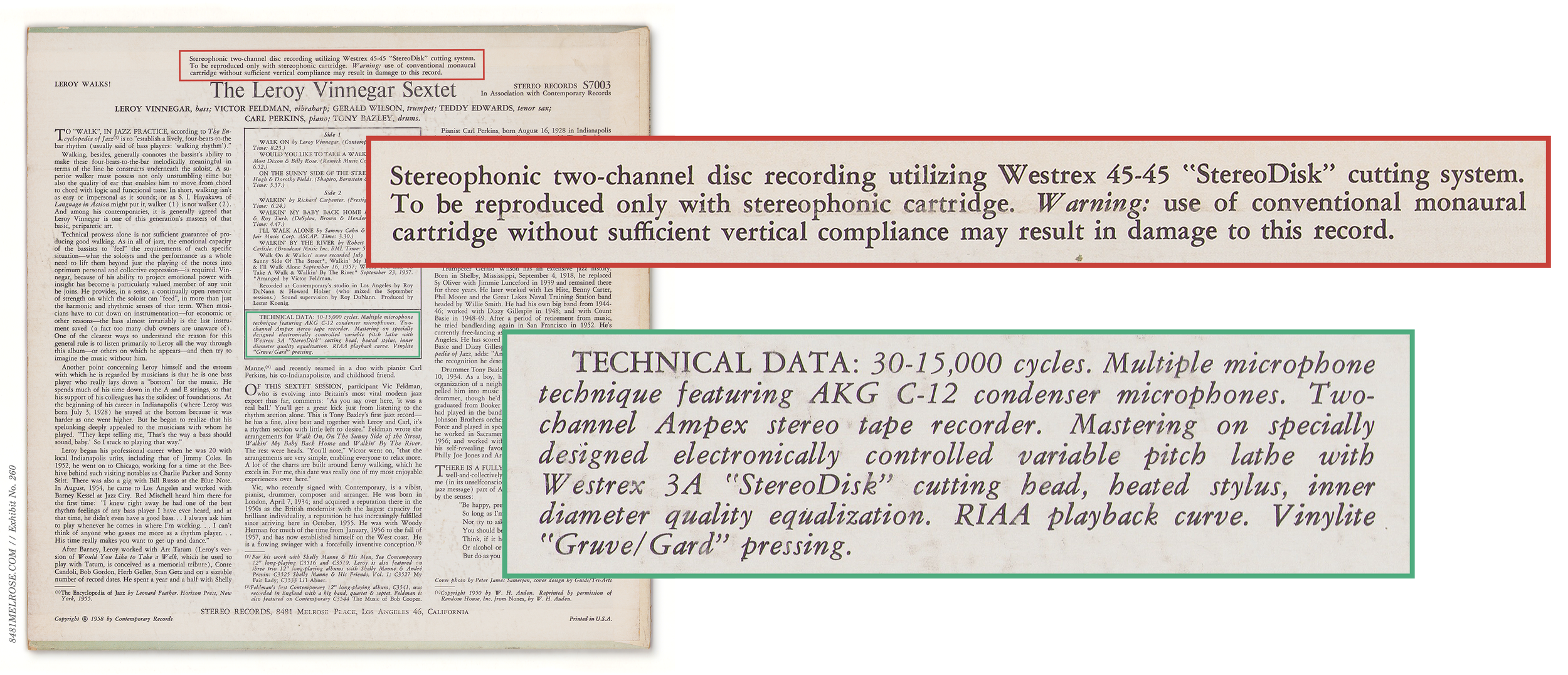
Going back to 1954, Lester Koenig had started adding informal recording notes to his 10-inch LPs. Early in the 12-inch run, this evolved into a boxed “Technical Data” section where recording was held in equal balance with mastering and pressing:


Multicolor Liners.
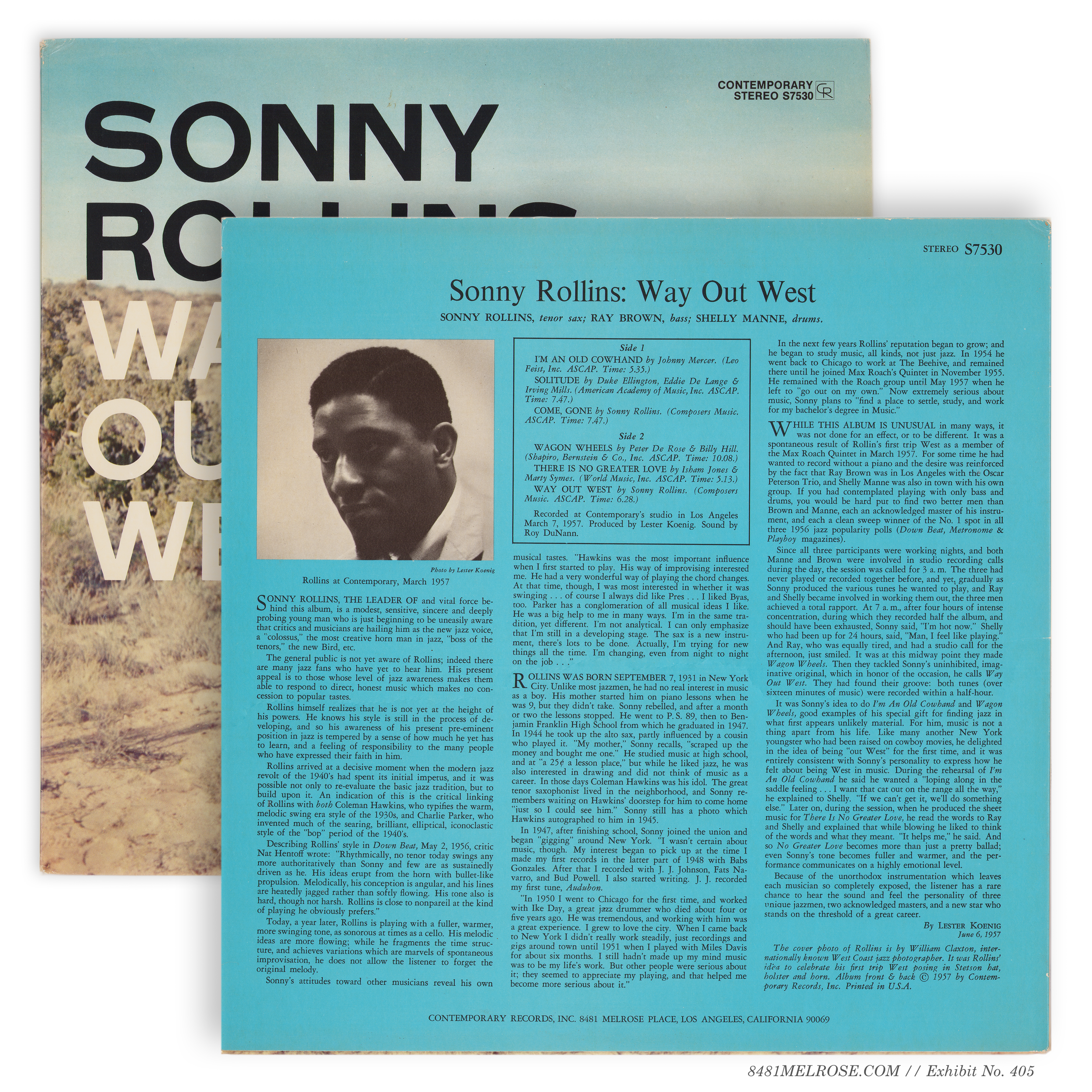
Contemporary liked to pop some color in the liner notes, highlighting the title and/or tracklisting box and other rules. These two- or three-color prints were often changed to single color (black only) with subsequent reprints.

Original three-color liners

Later monochrome liners
There was no general rule here. Some liners were monochrome to begin with (C3526) while others held their colors for several rounds of reprints (C5002) and even redesigns (C/M3527).
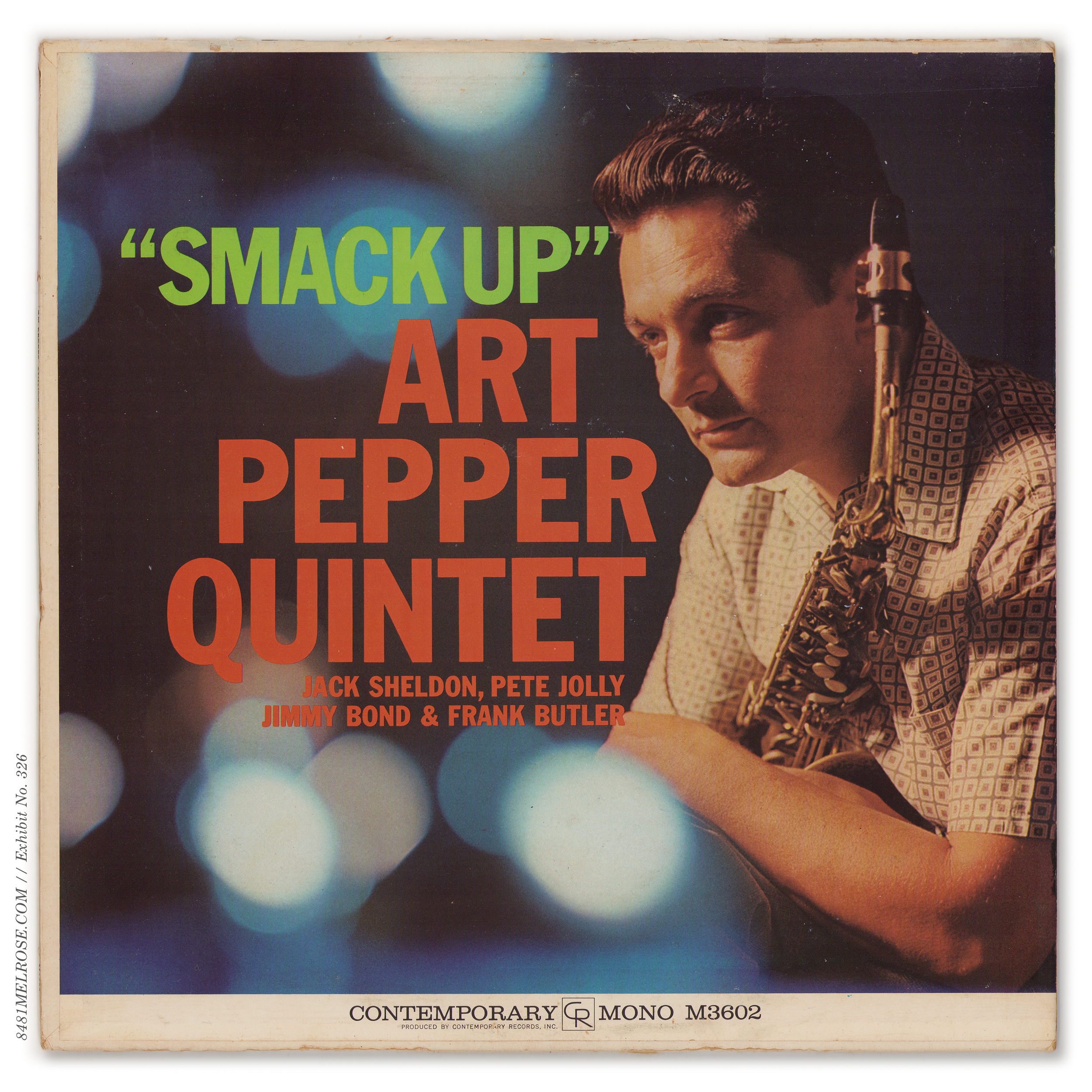
A few titles rejiggered colors, the low-hanging example being C3532 Art Pepper Meets the Rhythm Section, which dropped in 1957 with blue & magenta layers and was soon reprinted with these collapsed into red:

Original three-color liners.

Later two-color.
Mono Redesigns.
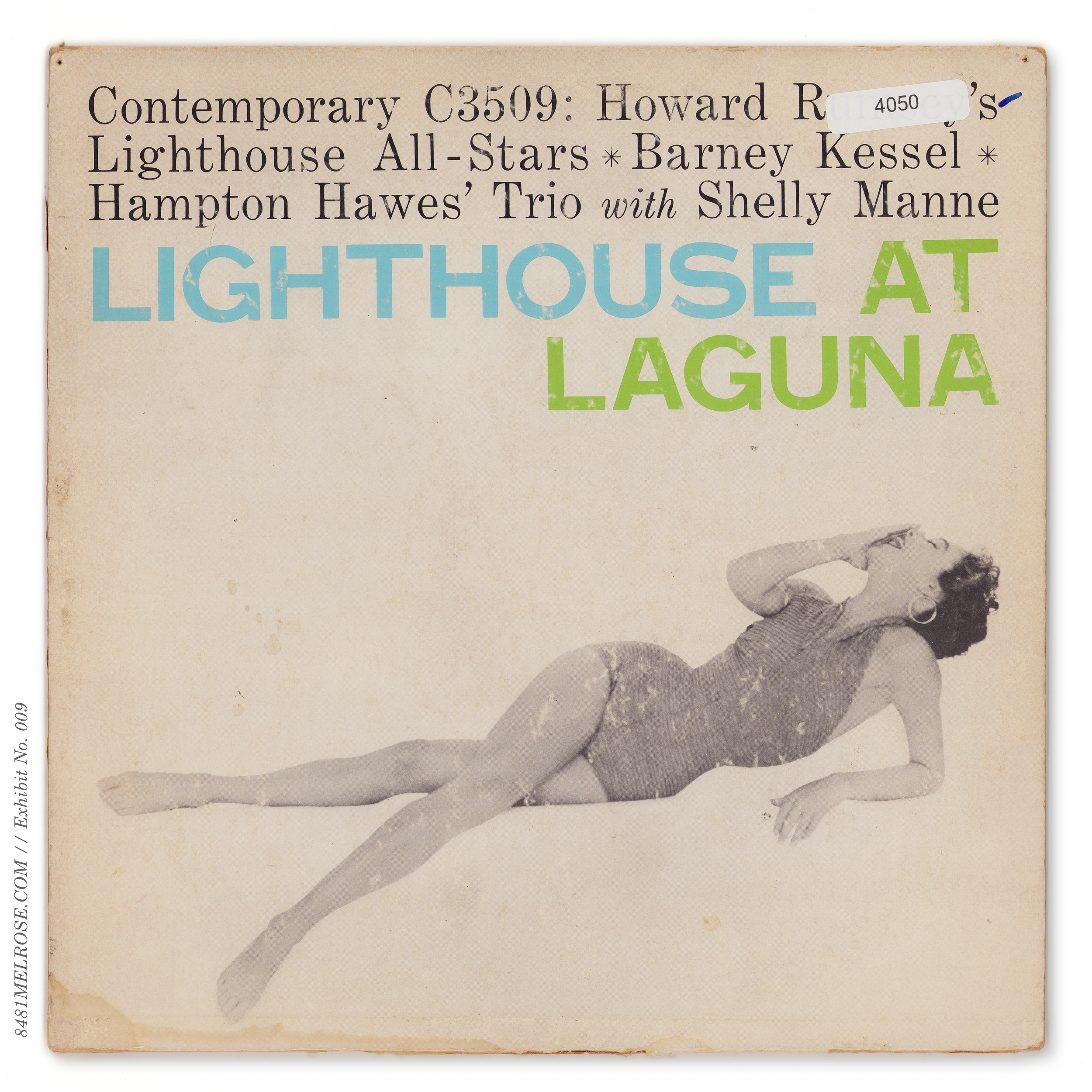
A handful of early mono titles were given a wholesale jacket rethink just a few years after release. Best guess, these were repositioning efforts to stimulate slow sales? I don’t know. Contemporary’s evolving aesthetic in these early LP years trended towards photo covers and, in line, some of these redesigns involved such a change. Here’s a few examples:
A different example was C3527 My Fair Lady.
Its original design prioritized artist over title, burying the show name in a block of title text. When sales proved blockbuster, revision was made so buyers couldn’t miss it:

Original.

Billboard Review. October 10, 1956

1957 redesign.
Artwork colorways.
Neighbors C3504 and C3505 were both cast in yellow, and both were eventually re-cast into blue variants. The rear liners were converted down from two-color to single-color, but the designs were otherwise left unchanged.


Timing is a hard to pin down on these two color swaps. A change like this wouldn’t be visible, for example, in the monochrome catalogs Contemporary slipped into late 50s and early 60s deliveries.
Contstruction and accompanying LPs help a bit. The blue C3504 I’ve only seen as a non-Gakubushi and it is stuffed with a c. 1970 green-and-gold label deep groove pressing.
The blue C3505 pictured here, however, is a Gakubushi jacket assembled 1960 or earlier. I’ve also seen an early 1970s press in a non-Gakubushi version.
C3505 was eventually swapped back to the original yellow in the mid-late 70s, but I’m not clear on whether C3504 stayed in print long enough to earn the same (though its 1982 Japanese reissue used the yellow design.)


A label dipping into stereo at this early stage faced multiple challenges, among them 1) attracting listeners into buying marked-up stereo LPs and 2) warning customers that these LPs were not backwards-compatible with mono pickups. Both of these responsibilities fell on the LP jacket and obligated bold, eye-catching messaging.
Lester Koenig took it a step further by launching sublabel Stereo Records to collect titles from all his labels under one unmistakable moniker. He’d compiled two years of stereo recordings by this point, always intending to take advantage of stereo’s nascency. That time had finally come.
However, the freeflowing designwork for released (mono) titles had been done without accommodation for stereo variants. Meaning graphic translation to stereo now had to be handled at this later date… which could have been an exciting stage of reimagination, were the design toolbox sufficient. Instead, most of these Stereo Records redesigns feel cheap and clunky, as the primary tool was actually a bludgeon:
The STEREO bubble.
This thing was thrown unceremoniously into whatever space the artwork left available. What delicacy the design once had was clobbered by a loud STEREO entirely disconnected from the original aesthetic.
A handful of Stereo Records titles avoided the bubble, however, and these were more than tastefully done. In particular the “Contemporary Composers Series” classical titles, already packaged with a bit more formality than their jazz brethren, were changed little beyond the label name. The buried stereo labeling on S7016, for example, just keeps the classy “front and back liner notes” style of the mono jacket. The buried stereo labeling here is evidence that, perhaps, warning away mono users was really a secondary concern:


Elsewhere, the addition of “IN STEREO” was deemed sufficient. S7017 Way Out West in particular finds absolution in stereo form, as if the extra text were always intended. Separately, S7021 The Famous Castle Jazz Band veers little from its mono variant (subtitled “IN HI-FI”) to preserve a truly singular Arnold Roth cartoon.


Liners: Tech Data & Warnings
Limited updates were made to the rear print to keep them accurate, and a polite warning was added across top for those with incompatible mono carts.
Early advertisements for Stereo Records noted “trade mark registration applied for.” I’m unclear whether it was granted, but the branding experiment was retired after less than a year.
Its impact lingered, though, as most Stereo Records titles retained the branding for several years of restocks and reprints. Modern reissues have since dug up the original SR jacket designs with the renewed industry focus on facsimile.
Find more detail on the Stereo Records branding here: From Mono to Stereo Records.


Stereo was quickly accepted. Contemporary chose to normalize the format by:
1) releasing mono and stereo variants of every new title with linked numbering, and
2) placing both under the same sublabel.
They still faced the creative task of designing separate formats, but with the Stereo Records experiment behind them and two-plus years of dual-tape-deck recording techniques under the belt, they looked for solutions to hybridize manufacturing of both deliverables.
Nowhere was this hybridization more visible than May 1959’s new jacket scheme, with a memorable banner design (other banner variations would follow, so I’m calling these specific graphics the FIRST Banner). These used rear-wraparound construction and required just one set of hybrid designs to service mono and stereo.

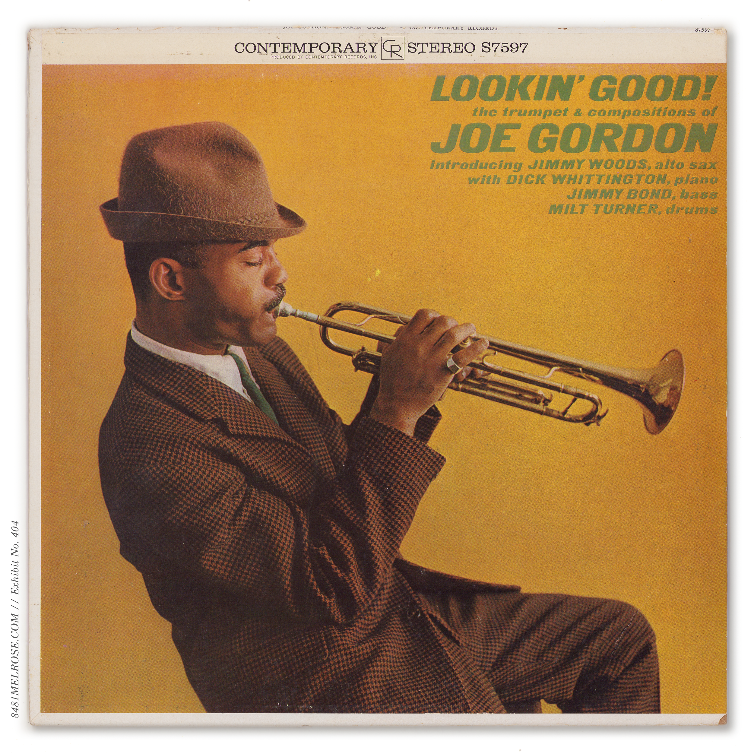
The front design limited artwork to a rectangle and placed “banners” on top and bottom, the top reading STEREO in bold and the bottom HIGH FIDELITY (for mono).
This full design was then cropped to leave either top or bottom banner in the final square, creating separate slicks for stereo and mono.


Though the banners were graphically independent of the artwork, their presence absolutely colored its execution. Forced to outperform the banner while also aesthetically cuffed to its style, designers turned to large, vibrant headers, essentially building competing banners using the titles themselves.
Hybrid packaging was hardly unique to Contemporary, but the choice to add banners to mono LPs was a clever move. Most labels using hybrid printing designed for mono by default then added a top banner for stereo, which meant pulling down the artwork to make room. Problem was, if the artwork was full-bleed, the stereo jacket would lose a significant slice off the bottom (as seen in the Argo example, Listen to the Ahmad Jamal Quintet):


This eventually encouraged the use of “matted” photography with wide solid-color margins that could be sacrificed over the seams without graphic loss. You see this, for example, on the 1965 Dylan albums Highway 61 Revisited and Bringing It All Back Home:


Contemporary, by contrast, limited its canvas to a rectangle that needed a banner above or below to complete the jacket square. This saddled the mono package with an unnecessary banner but preserved full-bleed artwork across both formats:


the technical header & footer.
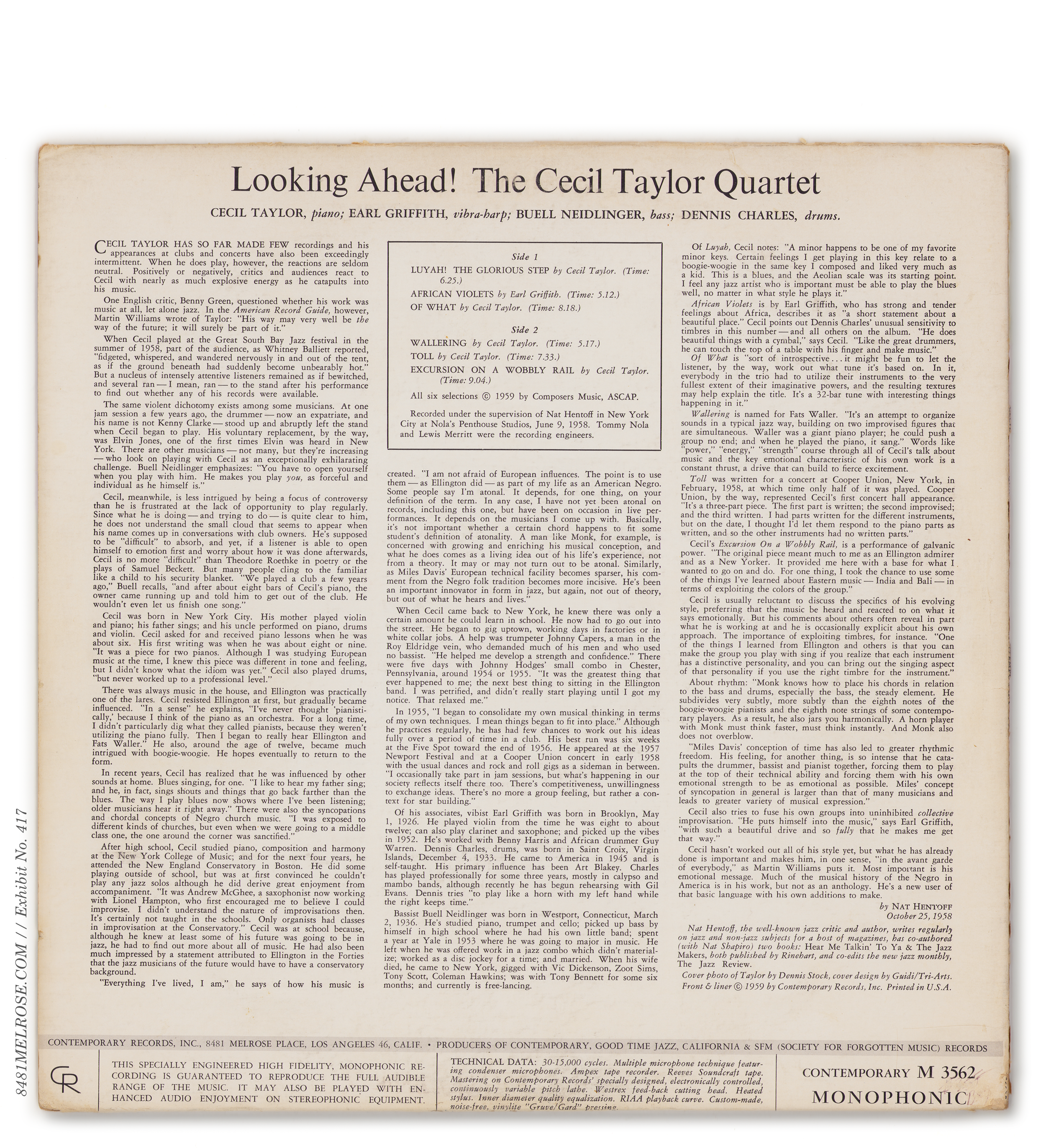
The rear design was handled in similar hybrid fashion. Liner notes were reduced to a rectangle to also allow “banners” which, to keep terms clear, we’ll call the technical header (stereo) and technical footer (mono). As the name suggests, these housed tech data, but also catalog number and label information.



hiding the brushstrokes.
The rear liners, like the front art, were printed as one sheet (including header and footer) and cropped at assembly for mono or stereo. As a result, you can often see vestiges of the unused header/footer hidden under the front print.

This is where jacket construction and assembly worked hand in hand with design. Note, for example, how vertical padding needed to be built into the wraparound print to cleanly execute these hybrid jackets without showing your hand:

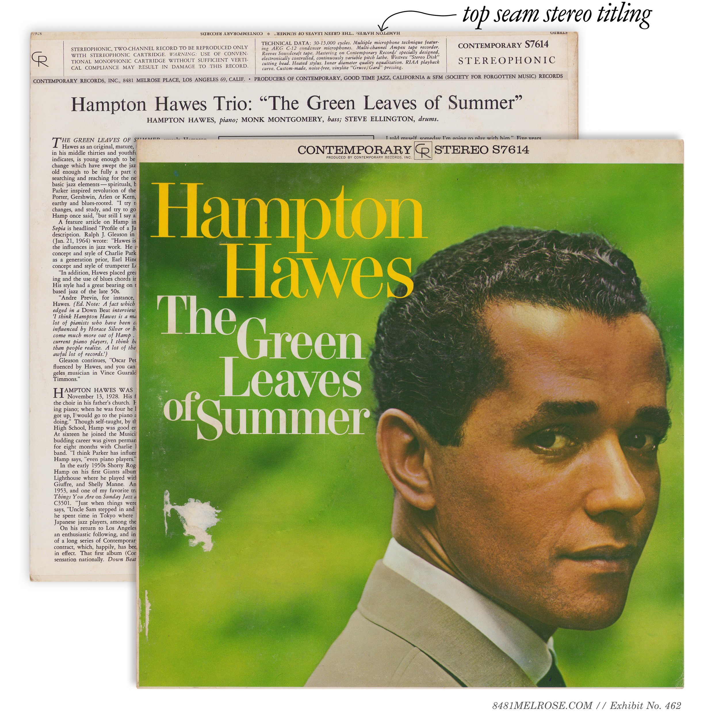
Top seam titling.
Above the stereo technical header Contemporary added a little easter egg for the bin browser: top seam titles. This was a common feature on 1950s/60s jackets, but for whatever reason I find Contemporary’s execution especially careful and elegant.
It’s a bit of a rush to find this text still in clean shape.
Incorporation & the CR logo.
Contemporary was, until 1959, really a sublabel of Good Time Jazz Record Co., Inc.
The introduction of the banner jackets coincided with a legal shuffle to appoint Contemporary the lead brand. Thus you’d now find Contemporary Records, Inc. denotations with appropriate legal subscript also added to Good Time Jazz and SFM titles:


This also marked the inauguration of the CR company logo, featured prominently on jackets across all sublabels:

The 1959 logo.

Contemporary Records.

Good Time Jazz.

Society For Forgotten Music.
Titles phased into 1st Banner.
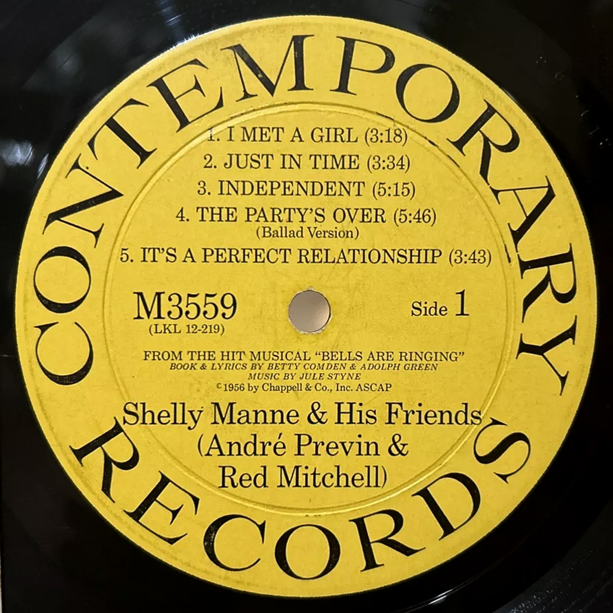
Going by catalog number alone, the earliest title to get the banner treatment was S7559 Bells Are Ringing, in stereo. Its mono variant, however, straddled the line between early mono and First Banner, the jacket on one side of the transition and LP labels on the other:
Sealed first printing, C3559
Original labels were already transitioned to M3559 numbering.
Advertising the M3559 catalog number while showing the C3559 jacket. (The Billboard, June 1, 1959)
On next printing, the mono Bells jacket was phased into the banner scheme and received the M3559 catalog number:

Sealed second printing, M3559

With c. 1959 inserts.
Like 3559 Bells, 3551 Something Else!!!! and 3558 Vernon Duke also straddled the 1959 transition. Each of these had:
a) its original mono release done in the early mono scheme, and
b) its original stereo release in a 1st Banner jacket.
A difference lies in the details, though. C3551 and C3558 were each released in mono during the Stereo Records era and were simply never chosen for that sublabel. Meaning, when they were belatedly released in stereo a couple years later, stereo variants of new titles had already been rebucketed under Contemporary using banner jackets. Once those stereo releases were born, hybrid printing phased the mono variants into the banner scheme.
Here are those three variants of 3551 Something Else: original mono, reissue banner mono, and original banner stereo.
Using these examples, we can outline the steps to phasing an older title into 1st Banner:
Branding & catalog number, formerly incorporated into the artwork, were repositioned into the banners. Cat number was updated to the M3500/S7500 catalog formats.
Similarly on the back: catalog number, label info, and technical data were moved from their former positions and dropped into the header or footer.
Legal language was updated to Contemporary Records, Inc. in multiple locations.


Earlier 3500 titles eventually phased into 1st banner format:
3527, 3530, S7533, M3535, 3543, 3548, M3551, M3558, M3559, 3560.
Timing is not consistent as to when a title might have been phased into this design scheme. Some, like 3521, 3527, 3543, and 3548 had both mono and stereo variants phased into the banner format in 1959/60 (as seen in Modern Jazz Catalog 10). Other titles took quite a bit longer.
The stereo banner Way Out West jacket, for example, was not available until the late 1960s, even though the mono banner variant was delivered a half-decade earlier. And the Peter Gunn stereo banner jacket wasn’t seen until the early 1970s, when the title finally shed its Stereo Records wrapper.
Again, we simply cannot generalize across titles.


The “1st banner” is immediately recognizable and iconic for good reason. The late-50s boxy aesthetic, the typographic melange, just… *chef’s kiss.* It was beautiful.
Graphically, though, it was bulky and restrictive. So in 1961, Contemporary revised its hybrid jacketing by slimming the banner profile and compacting its branding. This created a less dogmatic 2nd Banner scheme that posed less competition to the art itself.
And, vitally, the core benefit of hybrid printing was preserved.


The change didn’t impact the rear layout or liner notes.
The technical header/footer remained and its styling was unchanged:


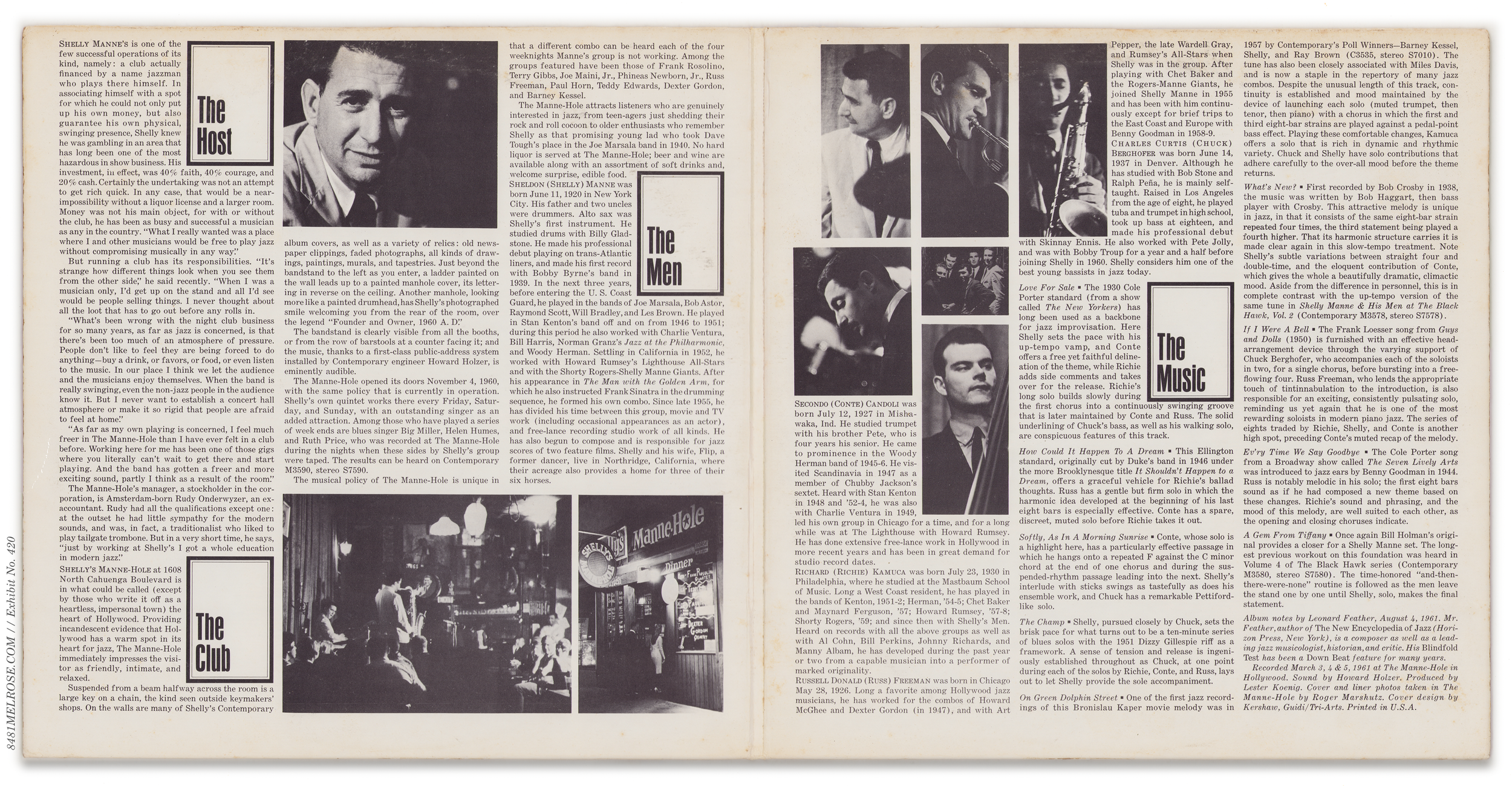
Contemporary dipped into the gatefold game for some double albums in this era. 3593/4 Live! was one such effort using second banner graphics and a little extra flair:

A return to front-wrap construction
In 1963, after four years of rear-wrap construction on new titles, Contemporary reverted its new titles to front-wrap. With the artwork able to bleed around all three seams, a solid color background became a common technique:
For some new titles, a couple of them seen above, the change meant losing top-seam stereo titling. This was eventually solved sometime in 1963 and top-seam text was affixed to the front-wrap print of subsequent titles.
Separately, around the same time (1962/3), Contemporary briefly experimented with film lamination for the jacket art.
This had zero impact on design so that there is a question for jacket construction.
Titles phased into 2nd Banner
Not many titles were phased/reissued/reprinted into the 2nd banner scheme. Many early mono/Stereo Records titles had already been translated to 1st banner (and in released in that form on the mono side at least) and thus didn’t need additional designwork at this time.
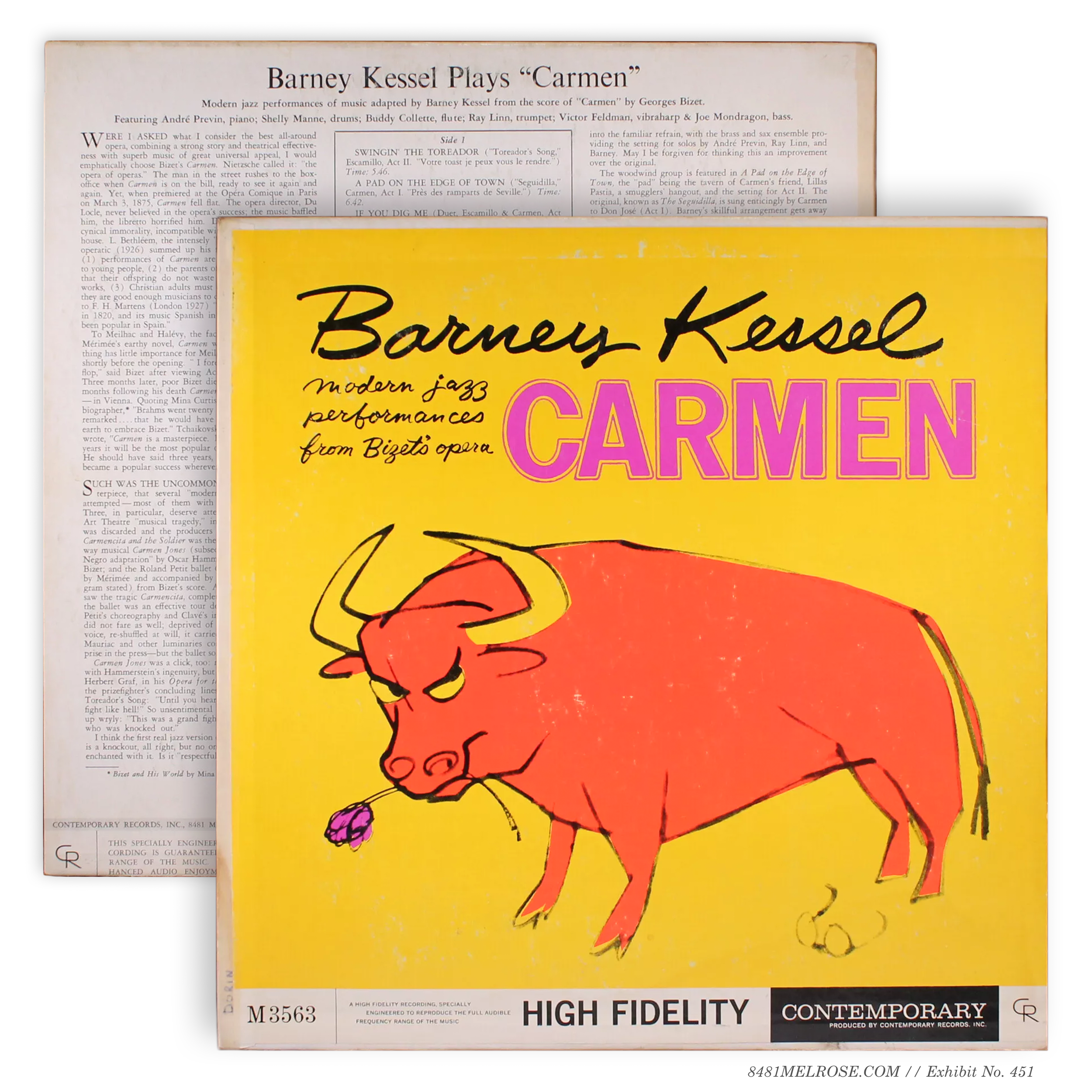
That said, there were a handful of bizarre redesigns from 1st Banner to 2nd Banner. In the case of 3563 Carmen, the change included typography and layout tweaks, while 3570 King Size just swapped the banner to give that lion a little footroom:
M3563 (1959)
M3563 (early 60s)
M3570 (1959)
M3570 (early 60s)
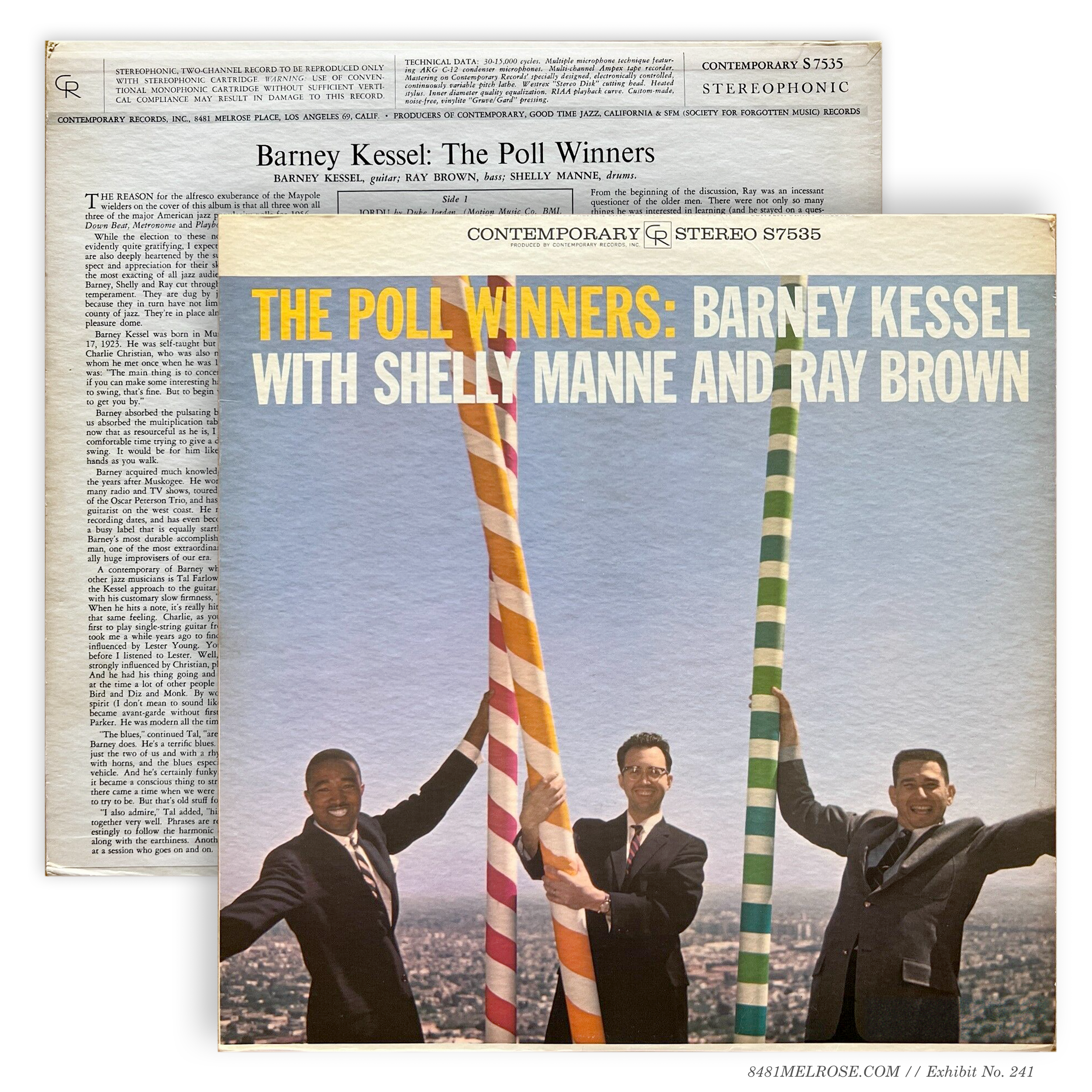
3535 The Poll Winners is a weird example of this. It of course debuted in early mono (1957) and Stereo Records (1958) schemes, and its mono was ported into the 1st banner style in the early 1960s (while the stereo variant persevered under the Stereo Records branding). In the late 1960s, the stereo title was finally separated from its Stereo Records wrapper and phased directly into 2nd banner with front-wrap construction (!) and top seam text:
M3535, early 60s reissue
S7535, late 60s reissue
So the first banner hybrid art had already been generated, but when it came to actually assembling a stereo variant, the graphic breathing room offered by second banner was worth the extra cost and effort.
I guess? I don’t know. Weird things happen. Who knows what other factors were at work here.
The Classical Second Banner
The Contemporary Composers Series adopted its own banner scheme in this period, with specific series branding and no technical header/footer across back.


the Los Angeles 69 postal code
This is going to be brief; more detail can be found at Postal Codes. However as we’re moving through jacket design in the early 1960s it’s important to note the address changes visible on Contemporary jackets around this time.
From the very beginning of the LP era (we can go back further, to about 1952), Contemporary’s address was 8481 Melrose Place in Los Angeles, and affixed to the end of that — prior to the state name — was the local 46 postal code.
Up to 1959, this address was generally splashed across the very bottom of each jacket, on the back. Pretty simple. But once CR moved to banner jackets, address information was moved into the technical header:

The early 1960s then saw the bifurcation of postal zone 46 such that 8481 Melrose Place was assigned to new zone 69. Contemporary’s new titles began to reflect this change in 1963:

Some older titles in banner 46 jackets were subsequently reprinted with the 69 code:


Note that Los Angeles 69 is different than the five-digit 90069 ZIP code which followed after this local change. Despite the full five digit ZIP supplanting the old local codes in July 1963, Contemporary continued to print the LA 69 code on its Second Banner jackets through 1964.
Why? Well, the ZIP may have replaced the local codes but they remained effectively interchangeable. Also — this is just my hypothesis, now — there was no room in the tech header to fit additional digits.
For full detail about these transitions, again, see Postal Codes.


This was Howard Holzer’s Super Bowl, a two-man 20-plus instrument date intended as Contemporary’s sonic beau ideal. A brilliantly odd duck indeed, it required some explanation. The packaging delivered.
Stereo was an extravagant single-LP gatefold that leaves me wishing they’d done more volumes:


The mono release, clearly the secondary version, was closer to a traditional jacket. It was printed as a single tip-on which abridged the components of the gatefold and applied the compact branding of Second Banner:

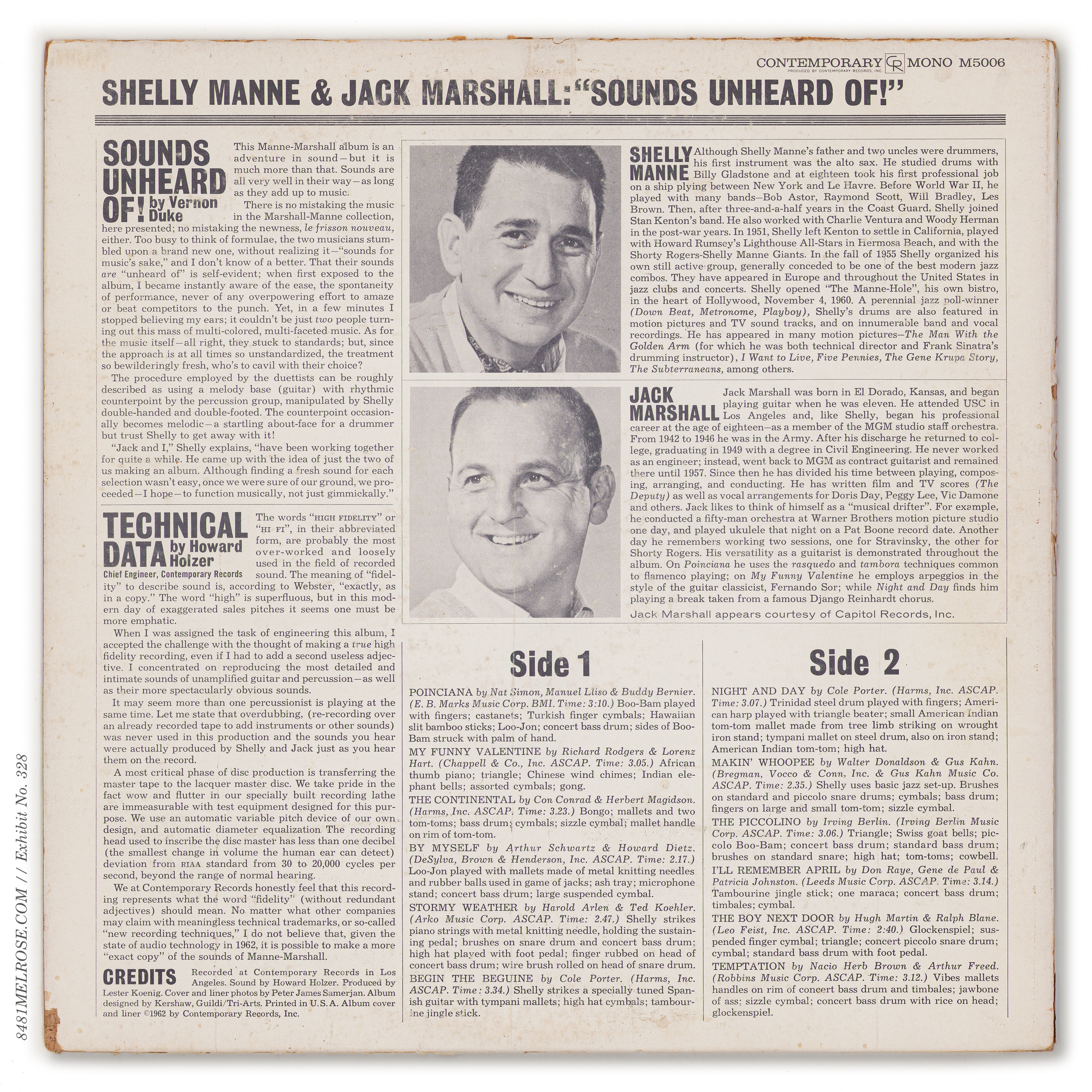


Mono’s last gasp. The final two Contemporary titles released in the dying format featured a banner format never seen before, and never needed after.


Front-wrap construction was maintained, with top seam text on the stereo. Liner notes were revamped — notably — without technical header or footer. In fact, technical data was eschewed entirely. Typographic rules were loosened as was the graphic tone.
The 5-digit ZIP code California 90069 was now used, with the full address splashed in sans serif (!) across bottom.

Note that the rear slicks were NOT hybrid prints in this scheme. The mono and stereo slicks are roughly identical but separate print runs: one with mono cat number, another with stereo.


‘Bannerless’ was not so much a design scheme as the vacuum created by the absence of one. With mono in the past after 1966, jacket design was able to move past hybrid printing and return to the freeform layouts not seen since the 1950s. However the branding practices of that bygone era were largely left in the past, as Contemporary pushed its name to the margins of its own jackets.
Designwork aged gracefully with the genre’s listening core and delivered them more reserved, less attention-grabbing art. Now an unspoken default, Stereo denotation was minimized or even forgotten.

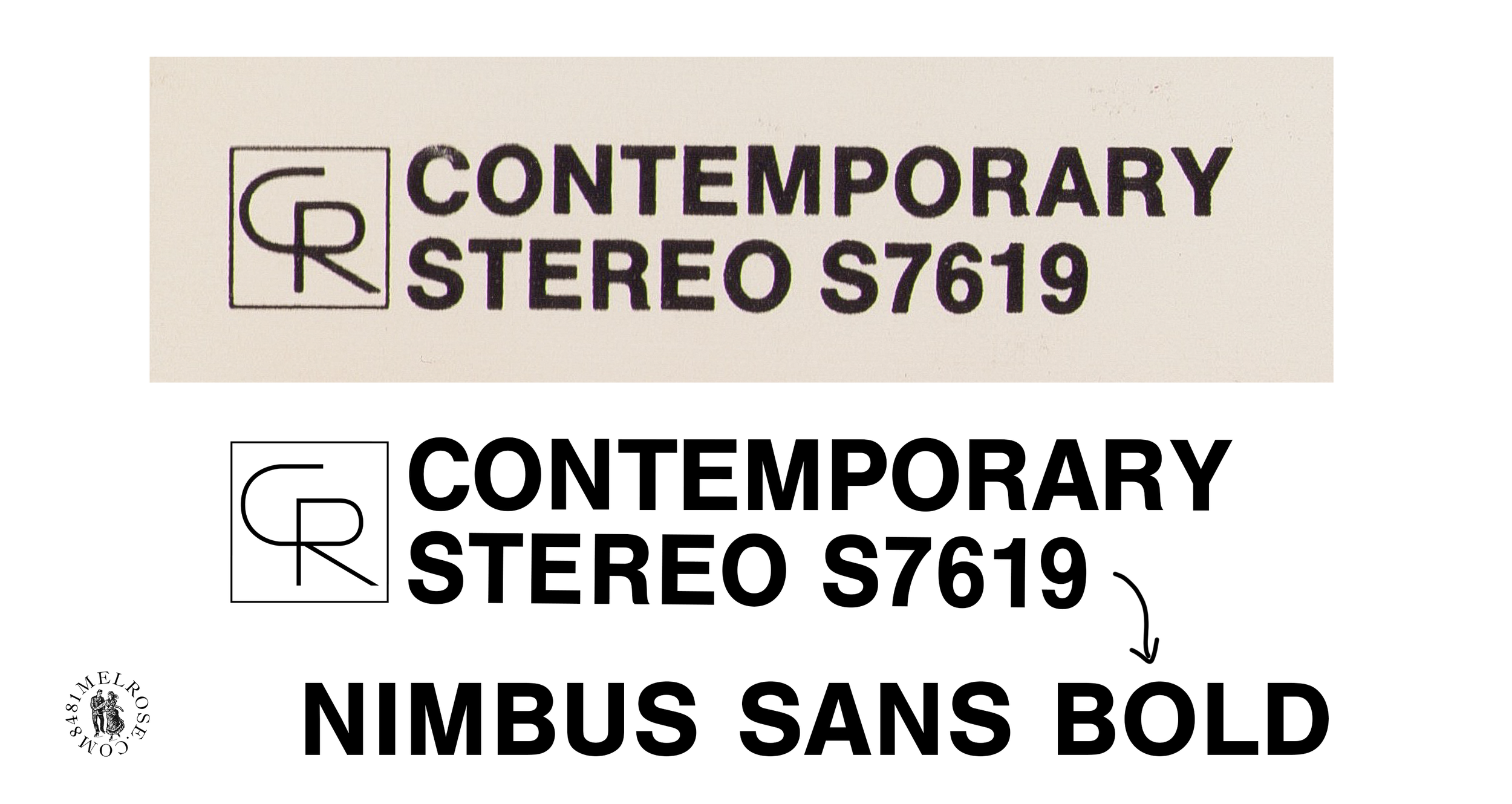

Copyright text, previously handled in the company banner or by language on the rear, was added to the front but sized for ants:

Titles phased into Bannerless
When mono variants were taken out of print post-1966, stereo reissue jackets were freed of any hybrid responsibility to the extinct format. So while new titles were being designed Bannerless jackets with condensed company branding, several catalog titles up for reprint were given the same treatment. Some mono-only titles (like C3515 This Is Hampton Hawes, in the grid below) were also subject to this translation… for whatever reason.
Top Corner Stereo & Mono Emulation
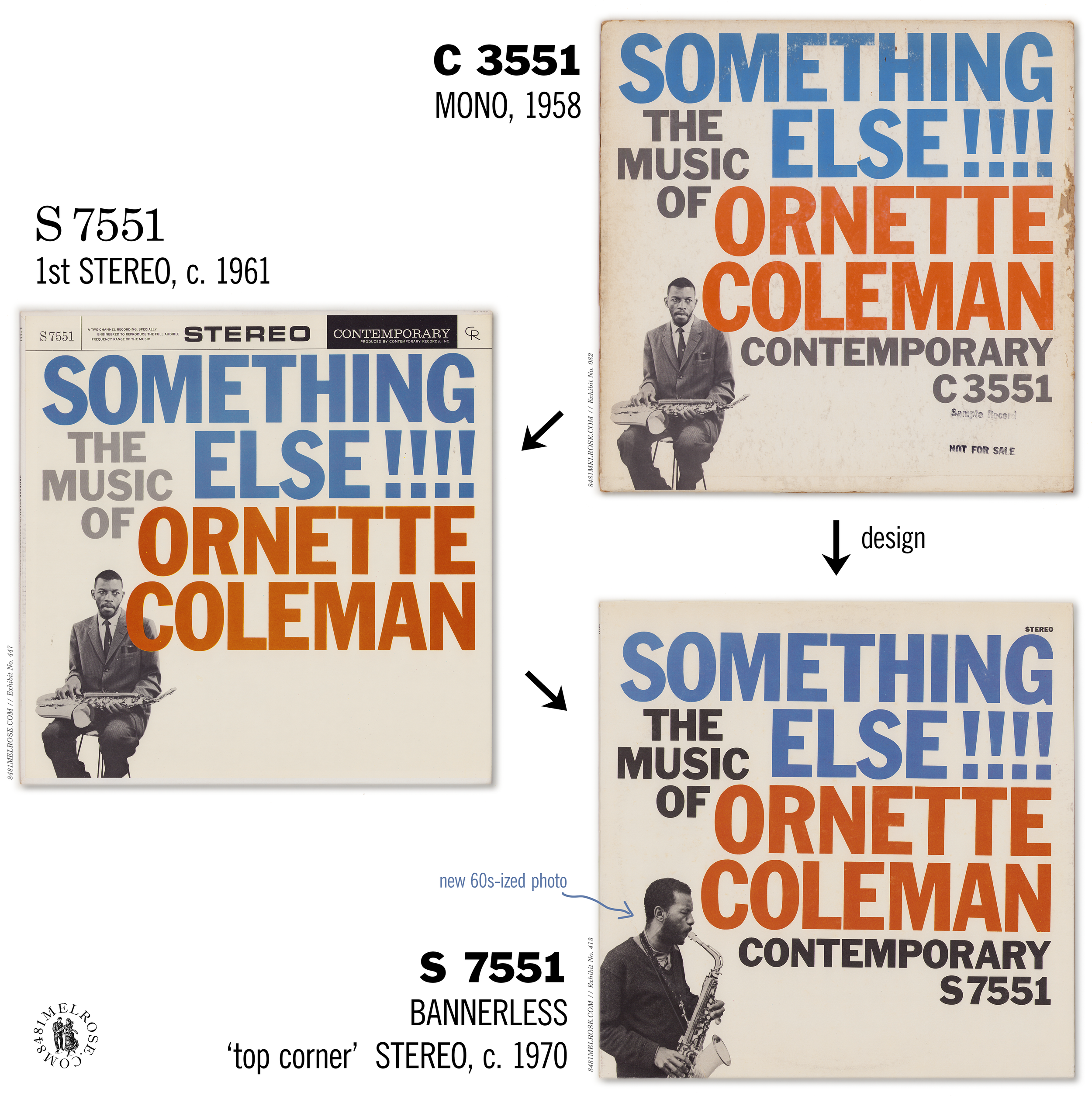
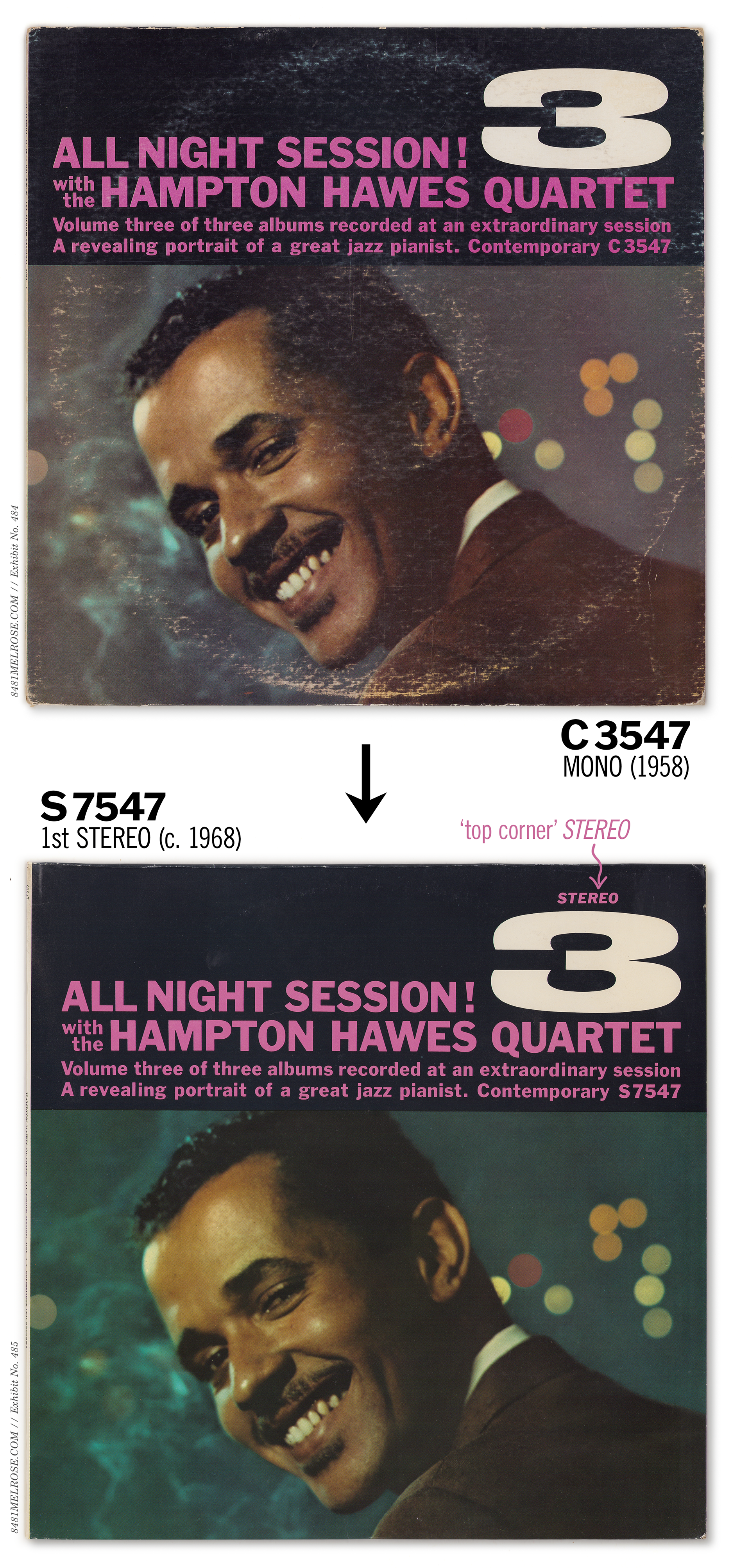
This was a subtle but significant subcategory within these reissues. Some catalog titles, rather than inserting a condensed company block, replicated pre-1959 mono layouts with Contemporary branding typographically incorporated in the art. Some of these let stereo go unannounced, though several added a polite STEREO reminder in the top right corner.
In these cases of “mono emulation,” even those that had been previously released in stereo, the original mono jacket was used as model for a stereo redesign:

Phantom banners
A few stereo titles received a decidedly light conversion into non-hybridity, with covers clinging to the original stereo banner layouts while also altering its width and style.
S7599 Checkmate kept a white strip atop its cover for… aesthetic reasons, I guess. This feels like the kind of jacket they would have taken full-bleed, so points for unpredictability.
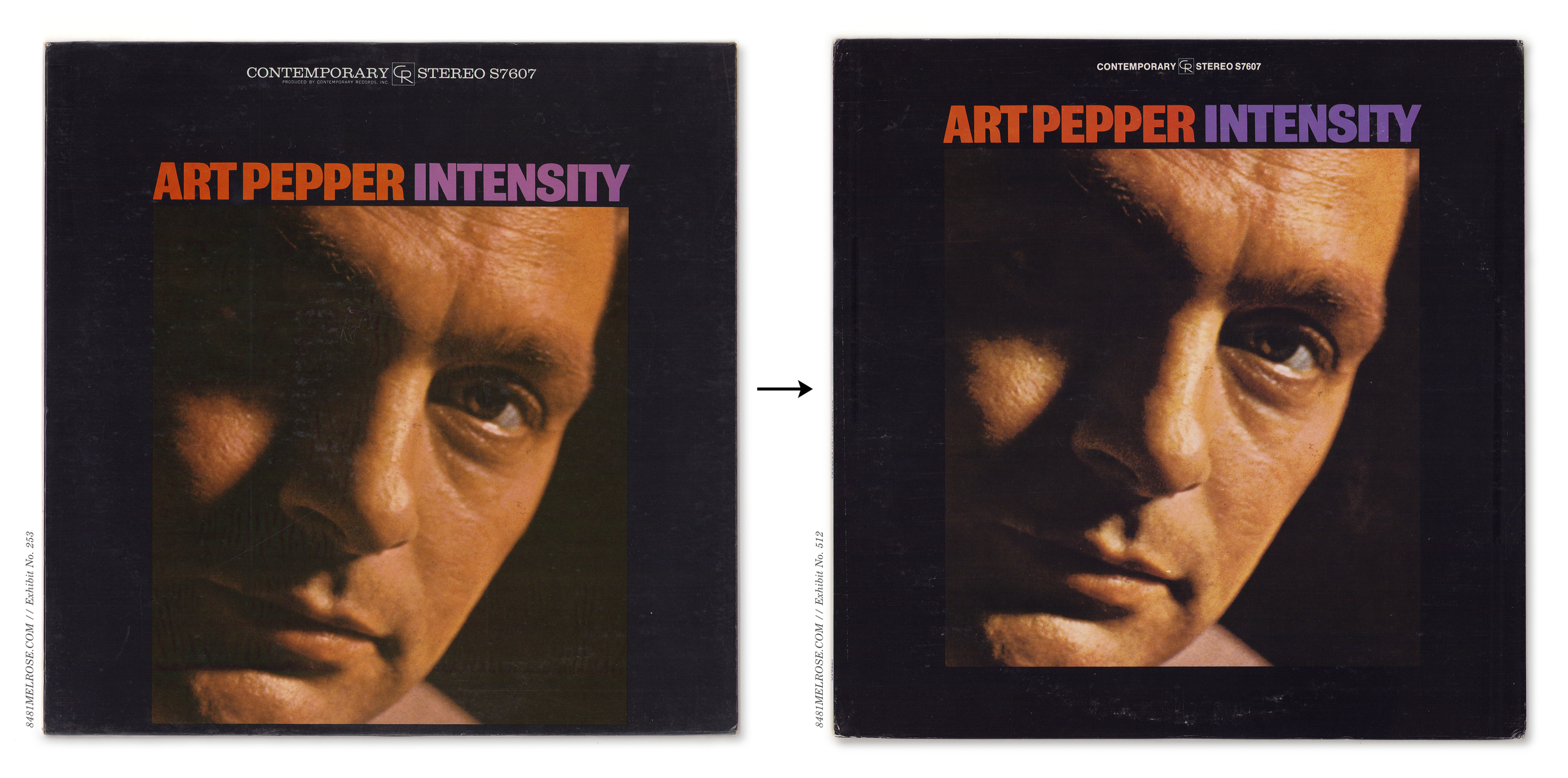
In the case of S7607 Intensity, with the layout no longer duty-bound to a mono bottom banner, the photo was pulled to center and branding shrunk into the smaller top window.

Retitles, Color swaps, & Groovy Typography
Numerous titles received a cosmetic revision in the 1960s and 70s because of… several reasons I’m sure, most of which I don’t recognize. Occasionally these were subtle enough and curiously straddled across an orange-brown divide:
The majority of such translations were a bit groovier. A batch of 1950s titles finally arriving in stereo in the late 1960s/early 70s experienced a youthful amendment to their font styles, occasionally earning them a new title in the process.


One title — S7539 Counceltation — was redesigned from scratch. This retired the You Get More Bounce cheesecake spread and, instead, put some respek on the late Curtis Counce.
Maybe a bit unmemorable, but if you’re comparing against the original, that’s… not a fair fight.

The 70s-ization spilled to some reissue titles which had been in the stereo market for more than a decade but, apparently, needed some typographic refreshment:


Some mono LPs caught the same bug. For example, C3507 The West Coast Sound was revamped in the spirit and palate of its 10-inch progenitor:

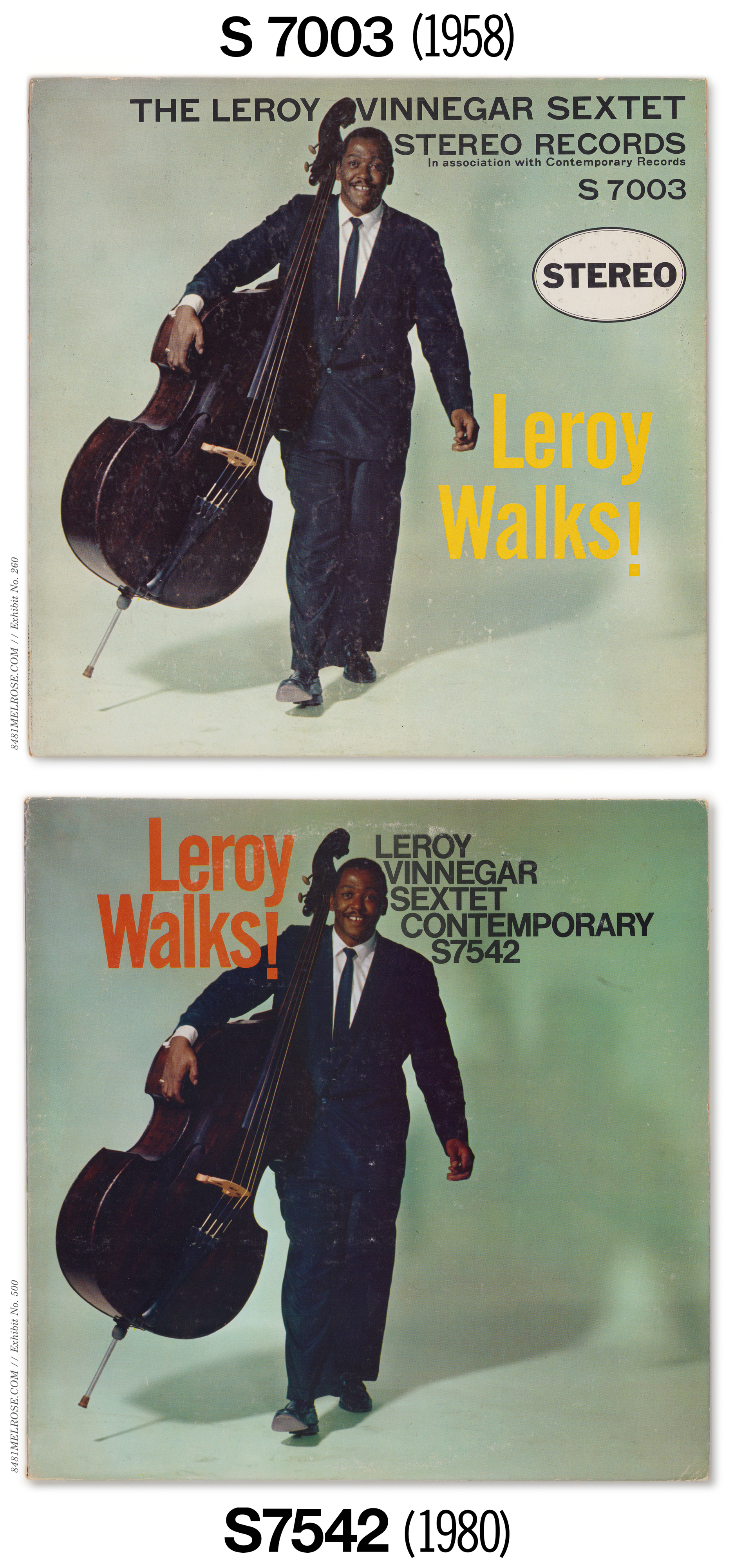
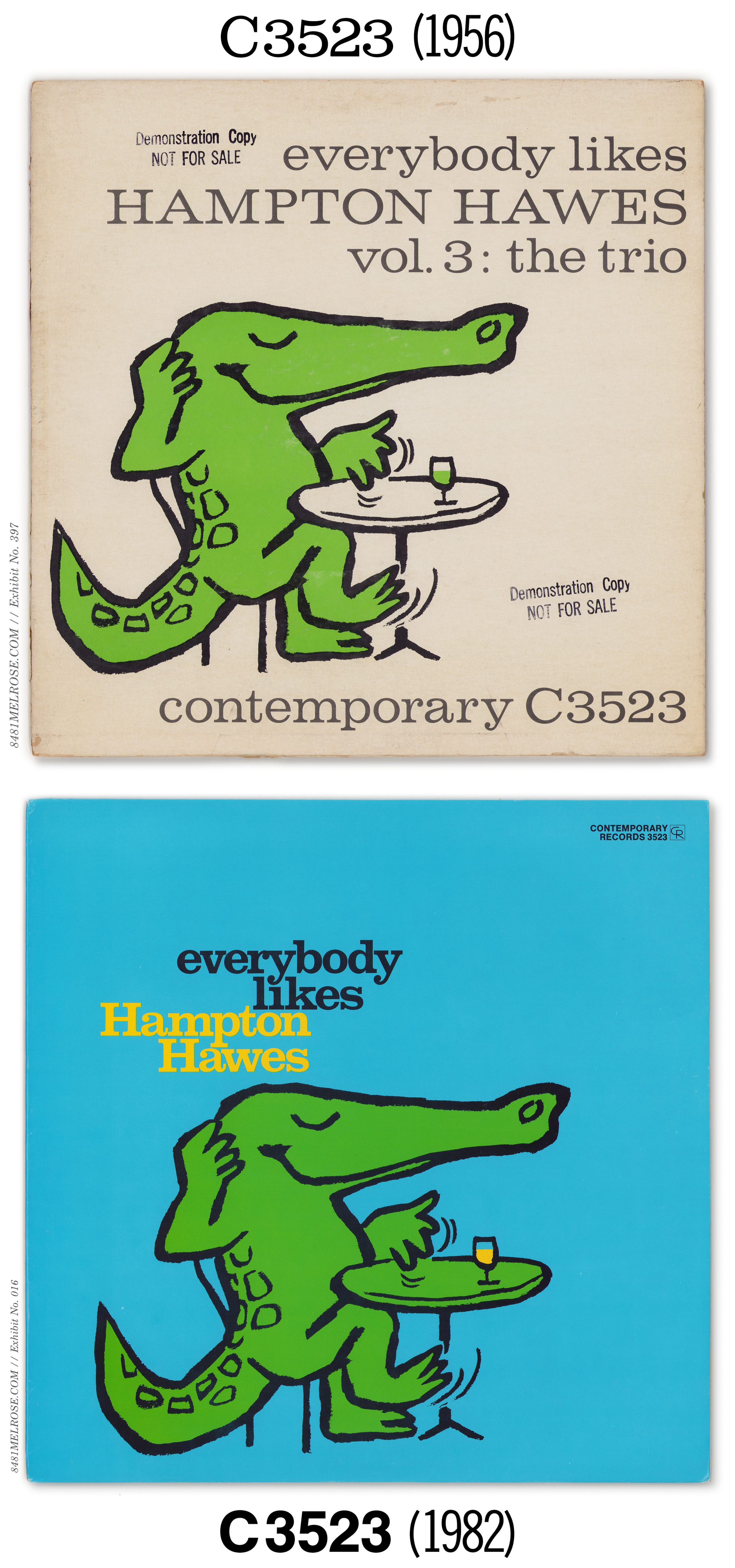
In a slightly different category, though effectively the same idea, were a series of redesigns released in (at least it seems these were not seen before) the early 1980s:

Technical data disappears
In removing the technical header (“the bathwater”) from the liner notes, Contemporary also threw out the Technical Data (“the baby”) it held.
Remember that several titles in banner jackets predated the banner schemes and had originally displayed tech data in a box under the tracklisting. If/when these were translated into banner jackets, that data was reshuffled into the tech header or footer. So the recording and mastering data that was once literally central to those jackets was discarded… for seemingly no reason.
I’m a bit baffled by it, to be honest. Though much of this technical block was boilerplate title-to-title, the decision to lose it feels entirely unnecessary.
Mixed jackets
As these Bannerless redesigns were being rolled out, most titles entered an in-between state of manufacture: new back, old front. The technical header was removed and new rear prints made with the 90069 address, but these titles continued using banner stereo fronts.

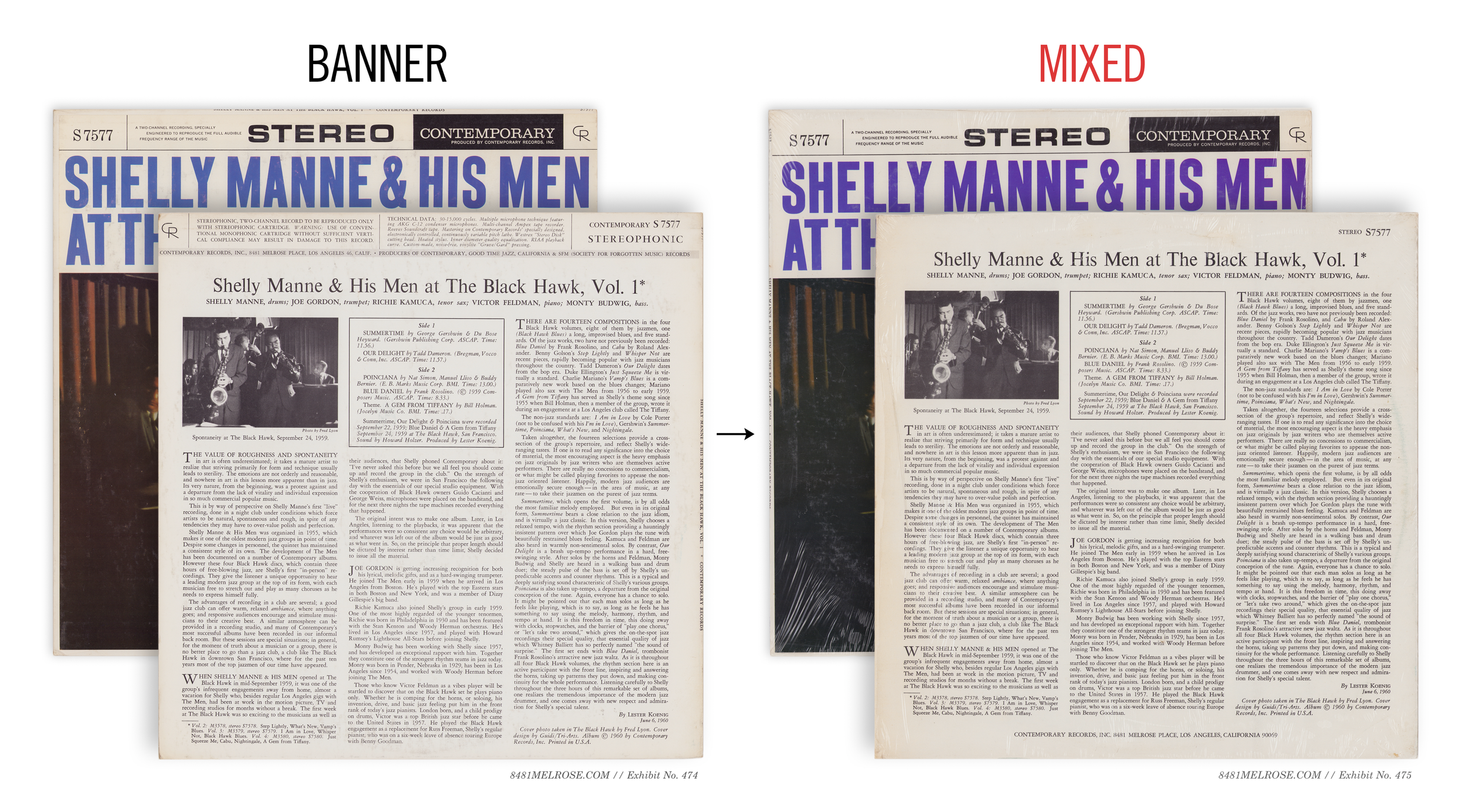


Banner —> Mixed —> Bannerless
It’s possible these Mixed jackets were a specific experiment to change just one side of the package rather than reinventing both the wheel and the tire. Personally I prefer to think these were transitional products to use up print inventory before phasing into bannerless front art.
I don’t think we can confirm either way, but it’s worth noting that most titles in mixed jackets were indeed phased into full bannerless design.
Forever mixed & 1980s reissue jackets
Several titles — specifically those that did not remain in continuous print through the mid-1970s — never grew out of the Mixed half-scheme. Some of these were later revived in the 1980s as “Contemporary Classic Now Available Again” reissues, at which point those mixed designs were reprinted (and/or the old mixed jackets pulled out of storage).
You can see that John Koenig was less willing to re-translate old jacket designs than his father had been. We can see some intention here, as most were tweaked to include the 1980+ P.O. Box 2628 address. Meaning there was opportunity for further redesign that went unused.
Many of these, despite a conversion to front-wrap construction, went so far as to emulate rear-wrap front slicks by designing a white border around the art.


I’m not sure how to explain the construction situation, as several 1980s reprints did use true rear-wrap construction…

… and some could be found in both construction styles.


The unknowable and a question of aesthetics
So were the Mixed jackets a by chance phenomenon stuck between two schemes? We’d need to accept some assumptions to make that work. I’m hypothesizing about all the Mixed examples above that 1) Les Koenig didn’t keep them in print long enough to grow them out of that half-scheme and 2) John Koenig chose to accept those jackets in their most recent form when reissuing them in the 80s.
That could be partly or entirely false. Stepping back, we shouldn’t disregard other unknowable randomness or title-specific considerations. One of those being the graphic link between a title’s artwork and its banner graphic. Consider S7561 Swingin’ the 20s or the four volumes of At the Black Hawk (S7577-80), which show a real typographic synergy between their own titling and the banner that sits above it:


It’s difficult to imagine these without the banner, right? We don’t know if Les Koenig had the opportunity to redesign these fronts into a bannerless style and chose not to or if they simply never advanced to that stage. I see the obvious graphical argument for preserving the banner style as an integral part of these covers… but we don’t know if that played any role whatsoever in the actual history here.
Point is, there’s a lot we don’t know and will never know, so we should keep the door open to logical possibilities.
My Fair Lady, beginning to end
Using the particularly active title My Fair Lady and what we know about Postal Codes, we can track six stereo jacket designs below, from Stereo Records (1958) all the way to a bannerless jacket with the PO Box address (1980).
Stereo Records
1st Banner (LA 46)
1st Banner (LA 69)
Mixed
Bannerless (90069)
Bannerless (PO Box 2628)
These isn’t even the whole run, because it doesn’t account for the multiple liner styles seen on banner M3527/S7527 jackets, where some had pink rules and others didn’t.
Also note how the pink hue varies dramatically throughout the run. It’s almost brown on the PO Box. Evidently, printing is more art than science.


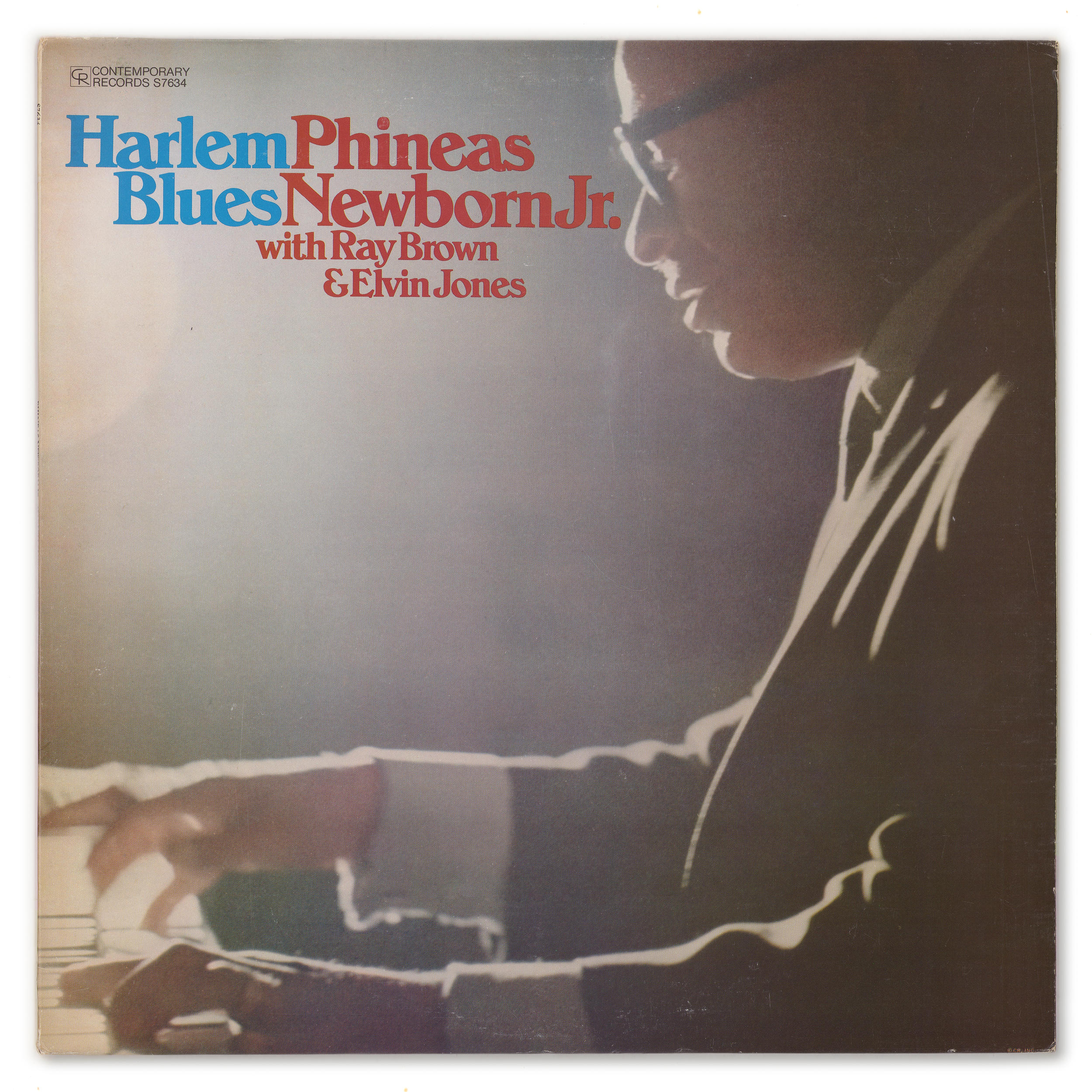
A new decade brought a fresh wave of design to ye olde Contemporary. John Koenig’s 14000 series, debuted in 1980, used direct-to-board jackets to deliver high-contrast portraiture and forward-looking colorwork.
Rightly or wrongly, I felt that, if we were going to stay Contemporary, we needed to be a little bit more with the times. If I was recording someone who hadn’t had a record before – for example, George Cables – no one knew him as a leader. I felt like the audience needed to identify with the person. I always wanted to have a good portrait of someone who was new, so that the public could identify with the artist.
—John Koenig
(from Michael Jarret’s book Pressed For All Time)
Color liners & Memphis Design
The real newness here was on the rear, as the label took advantage of the full-color freedom made easy and affordable by direct-to-board construction.
Some of these leaned into geometric shapes and bright colors. These were early entries into what would become known as Memphis design, a post-modern movement led by the Memphis Milano art group.
Because of their mutual dislike of the minimalist design style of the 1960s and 1970s modernism, the group of creatives set out to make postmodern furniture, fabric, patterns, ceramics, and other decorative objects inspired by art deco and pop art, bonding streamlined geometry and electric colors.
Art Pepper’s three nights At The Village Vanguard — the remainders of Lester Koenig’s late career — hit the market in 1980 and 1981 with similarly full-color packaging:
Older titles touched by full-color.
An exclusive group of titles were re-colored in this era to take advantage of full-color liner notes. Among them, naturally, were the two Contemporary show pieces Way Out West and Art Pepper Meets the Rhythm Section.

