THE CONTEMPORARY BASICS
label colors
yellow labels
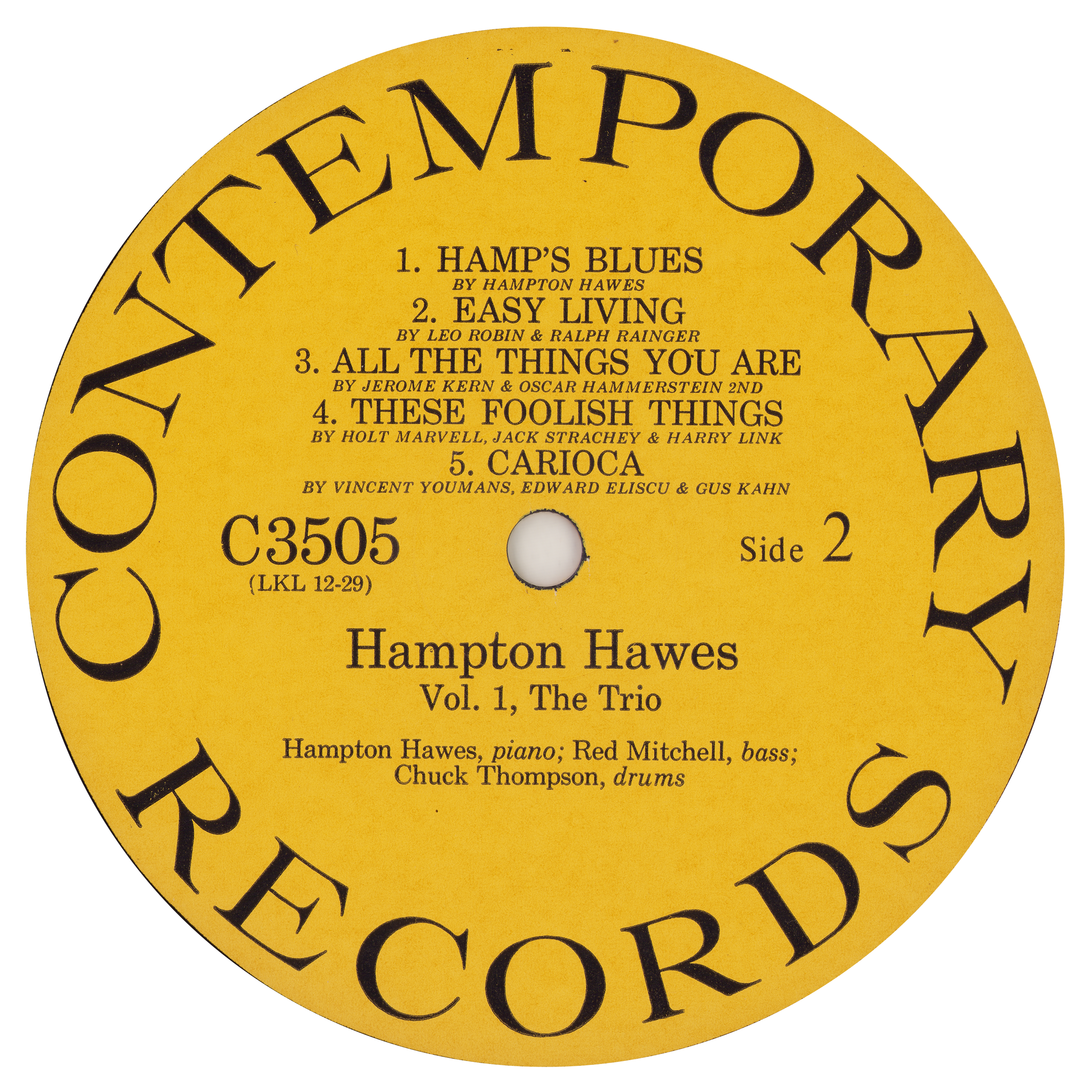
MONO YELLOW (1953-84) Date Floor: 1953 Dominant: 1955 to 1966 Yellow was Contemporary's mono label color reserved for the C3500/3600 'Modern Jazz' series. After Contemporary's last mono title was released in 1966, yellow was discontinued and both mono and stereo pressings were moved onto green. The few mono-only titles which stayed on yellow labels btwn. 1966 and 1972 (such as C3505 seen here) were likely using up yellow remainders from earlier runs.
STEREO YELLOW (1972-84) Date Floor: 1972 Dominant: 1972 to 1984 Yellow was restored as Contemporary's main label color in 1972, but now for stereo as well as mono. Yellow was not used for stereo pressings until this point.
FANTASY YELLOW (1984+) Date Floor: 1984
stereo yellow label examples
Yellow was not used for stereo releases until 1972, and then stayed dominant through the next twelve years of Koenig ownership. We see in this stretch a diversity of label designs printed on the yellow stock, from re-creations which stick closely to early 1960s original design to the rejiggered layouts and stylized text of titles which debuted later.
1972, first stereo release of this title.
1973 Monarch repress (orig. stereo release 1972)
mid-late 1970s
mid-late 1970s
1977
1979
1981
1982
Fantasy, post-1984 After acquiring the Contemporary catalog, Fantasy kept yellow as the label standard but abandoned the old design schemes.
Black labels
Contemporary first introduced black labels with the Popular Series in 1956.
It 1958, the same gold-on-black scheme was chosen for the Stereo Records sublabel, which collected stereo variants of titles across Les Koenig’s umbrella.
In 1959, Stereo Records was retired and stereo variants of future titles shuttled back to their home banners (eg. Contemporary, Good Time Jazz, etc.) The gold-on-black coloring was maintained and became the standard stereo theme for stereo deliveries across Contemporary, Good Time Jazz, and the Society for Forgotten Music.
'POPULAR SERIES' MONO 4 titles: C5001-3 (1956); M5004 (1960). Titles likely moved onto dark green labels for reprints in early 1960s.
STEREO RECORDS (1958+) Stereo titles released 1958-March 1959. 30 titles, S7001-30. Some underwent multiple reprints on black Stereo Records labels between 1958 and the 1973. Others were ported earlier to Contemporary for stereo release. Varies by title.
CONTEMPORARY STEREO 1959+
Black labels
glossy vs. pearlescent
1950s and early-mid 1960s black labels were printed on glossy paper stock. In the mid-late 1960s, a different pearlescent black label began to appear. Some in-print stereo titles continued to be pressed on glossy black, but other titles were quickly transitioned onto pearlescent labels. A few titles sported both types, one on each side — which suggests that pearl was indeed considered a functional replacement for glossy black after the original style was made unavailable for whatever reason.
The images below show otherwise-identical discs pressed on the two different label stocks:
DARK GLOSSY BLACK Black label print runs 1956 to 1966ish
'PEARLESCENT' BLACK Black label print runs post-1966
pearl black examples
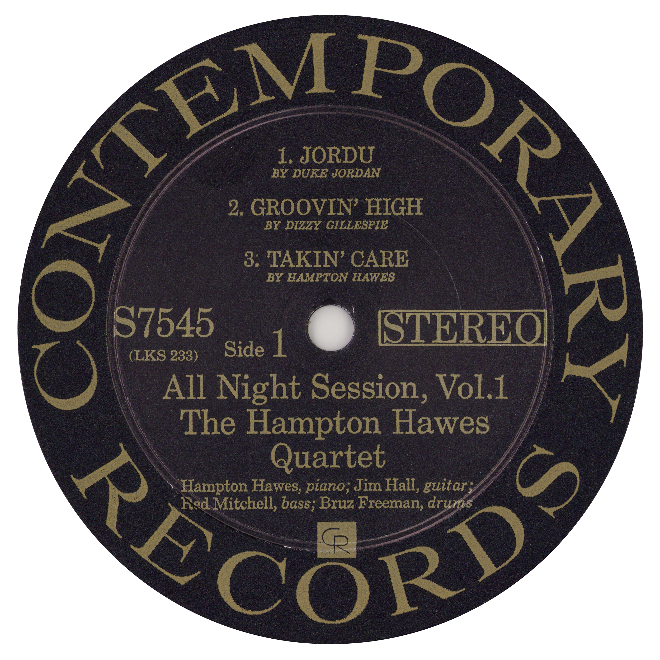
The pearl black was almost entirely used for reissues and titles off the shelf like S7545 seen below.
S7545 original stereo release Pearl black labels c. 1968 This title, recorded in 1956 but not released until 1958, had to wait an additional decade for the stereo mix to see the light of day. It was debuted on pearl black labels c. 1968.
Pearl black reissue (late 1960s) Way Out West stayed on the Stereo Records label into the late 1960s, at which point the stereo version was finally moved to Contemporary. Contemporary S7530 was debuted on pearl black labels.
Pearl black reprint (early 1970s) This Stereo Records title maintained its branding into the 1970s. (The 26mm pressing ring points to 1970-1973 @ RCA Hollywood.)
Early Green labels (pre-1966)
The green label goes back to 1953 and Contemporary’s first 10-inch stereo releases C2001 and C2002. Green was used for mono classical pressings from that point forward, but in the early 1960s or so it was also given to the Popular Series, which had originally been printed on black.
C2001 (10", 1953) Contemporary's inaugural classical releases dawned with green labels.
Classical Titles 1958-66 (MONO) Green stayed in use for mono classical titles, the last of which was M6013 Gail Kubik.
'POPULAR SERIES' Green Some runs of the 'popular series' 1956 titles were done on green labels c. the early 1960s, or perhaps earlier.
Later green labels
(1966-1972+)
Green was promoted to Contemporary’s primary jazz color after 1966. New titles from 1968 to 1971 were all debuted on green labels, with the exception of perhaps S7623 Rumasuma which seems to have had a run on black.
During the same period, numerous titles had labels reprinted on green. This applied to mono-only titles and stereo titles alike (though some stereo titles were pressed with black labels… there is a lot of nuance to the black vs. green balance but it is really a question that requires title-by-title attention).
This lasted until 1972, when green was overtaken by yellow. Some green labels persisted past that point, as stock was run through for each title before changing colors.
1969 new title
1970 new title
late 1960s reissue (originally on yellow)
early 70s reissue (originally on glossy black)
early 1970s reissue (previously on glossy black Stereo Records, then pearlescent black Contemporary)
c. 1973 Monarch repress (title previously on glossy black and pearl black... this 1973 pressing uses leftover green labels before switching to yellow.)
White Label Promos
1962-1973
Contemporary printed dedicated black-on-white labels for promo/demo copies while pressing at RCA.
The first of these came in 1962 and the final one was S7631 I’m All Smiles in 1973.
1962
1963
1966
1969
1971
1973
Other CR Inc. Label Colors
Other Lester Koenig imprints used colors of their own.
RED Good Time Jazz
ORANGE California Records
MAROON Society for Forgotten Music


