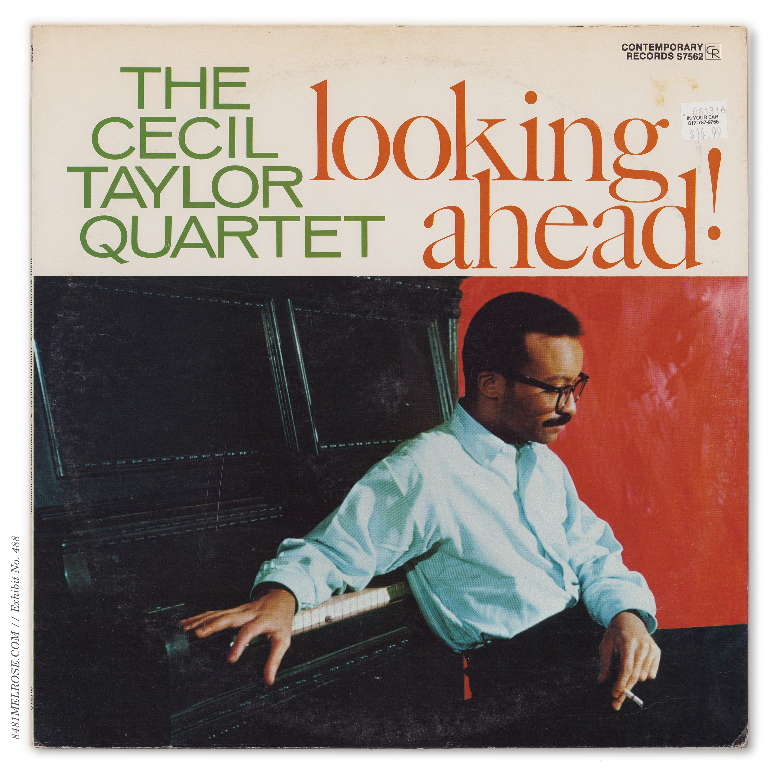
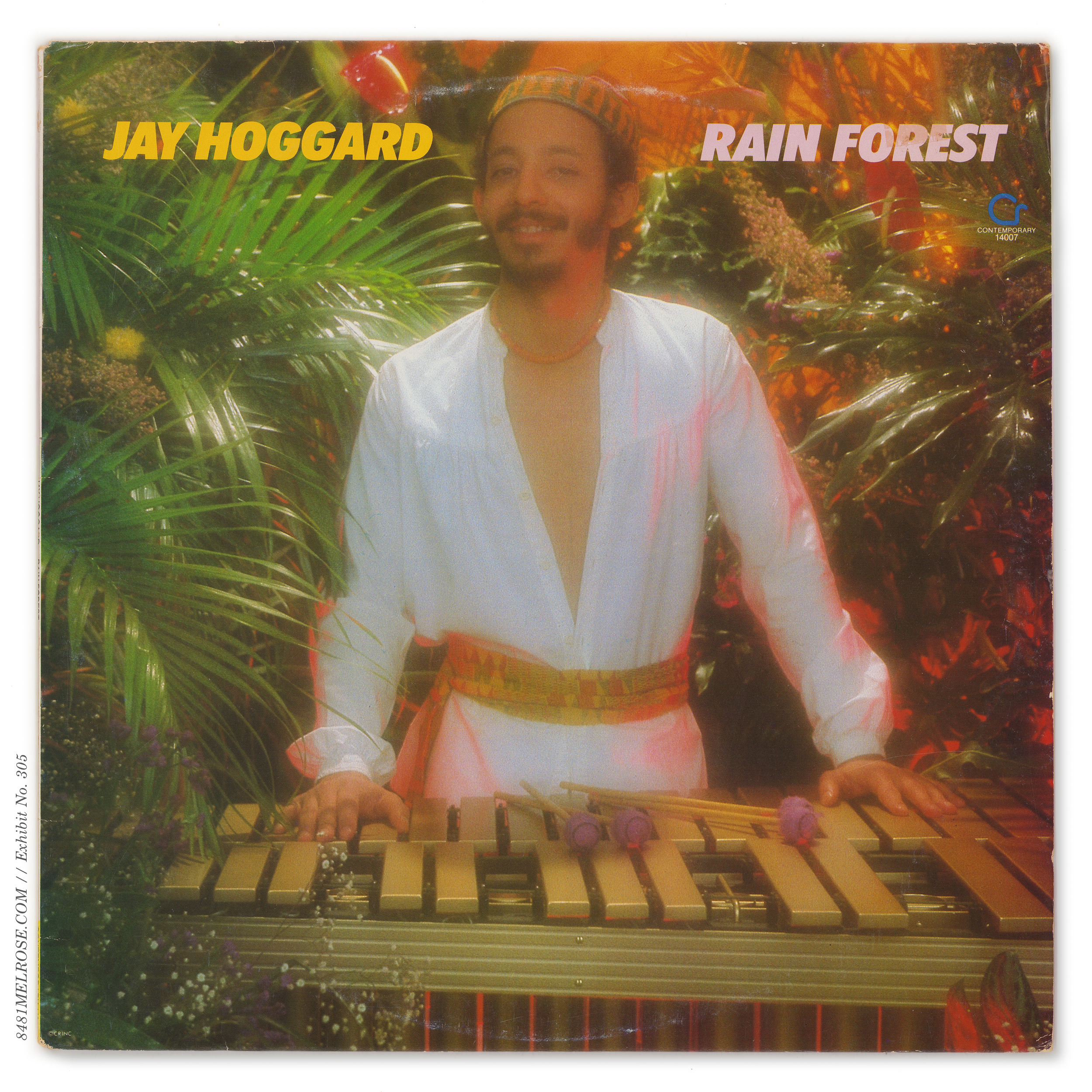
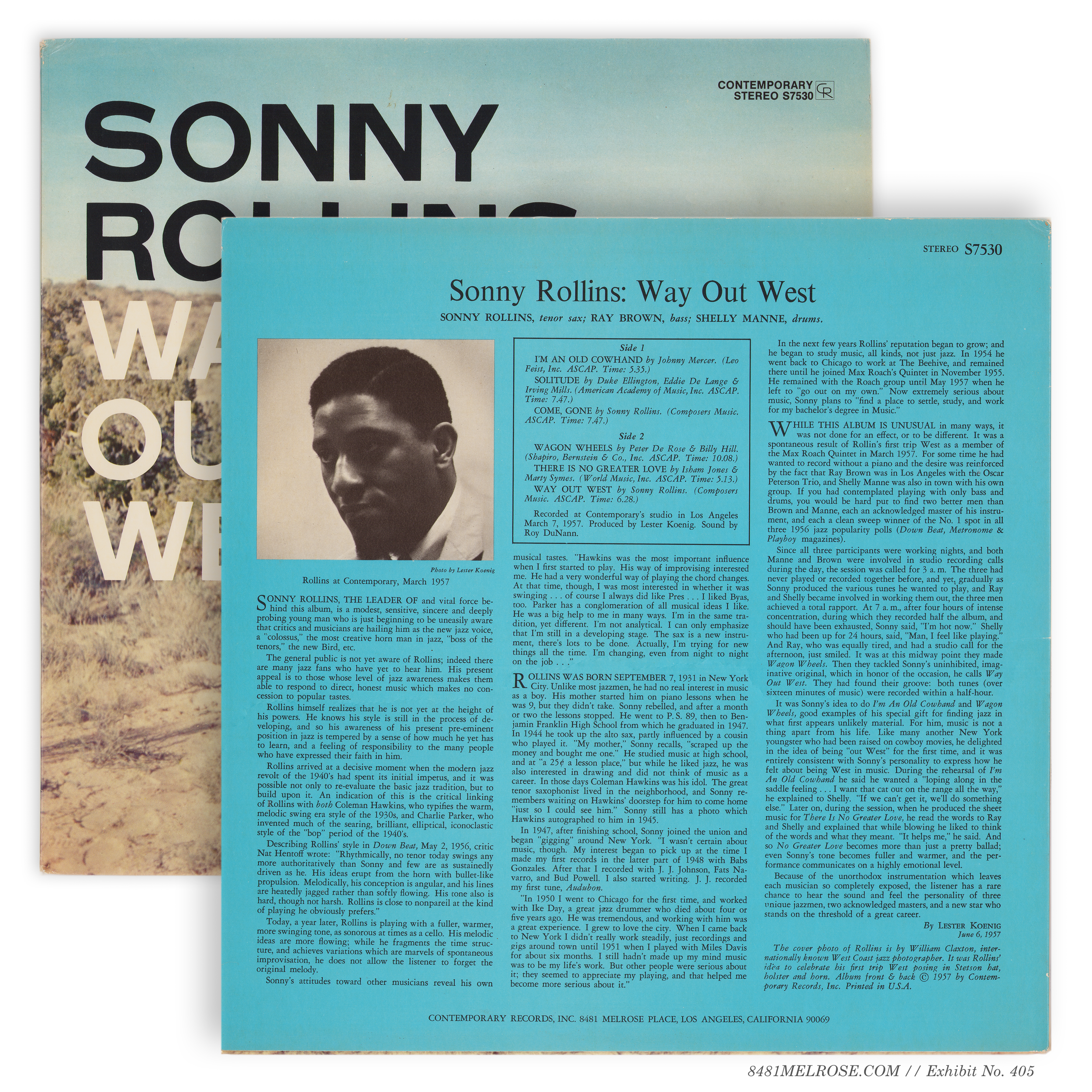
THE CONTEMPORARY BASICS
jackets & inners
Chapters: jacket design | jacket construction | inner sleeves
(this page collects abridged versions of Jacket Design, Jacket Construction, and Inners & Extras)
1) jacket design


Multicolor Liners.
Contemporary liked to pop some color in the liner notes, highlighting the title and/or tracklisting box and other rules. These two- or three-color prints were often changed to single color (black only) with subsequent reprints.

Original three-color liners

Later monochrome liners
There was no general rule here. Some liners were monochrome to begin with (C3526) while others held their colors for several rounds of reprints (C5002) and even redesigns (C/M3527).
A few titles rejiggered colors, the low-hanging example being C3532 Art Pepper Meets the Rhythm Section, which dropped in 1957 with blue & magenta layers and was soon reprinted with these collapsed into red:

Original three-color liners.

Later two-color.


Despite the sublabel being discontinued in 1959, most Stereo Records titles retained the branding for several years of restocks and reprints. Modern reissues have since dug up the original SR jacket designs with the renewed industry focus on facsimile.


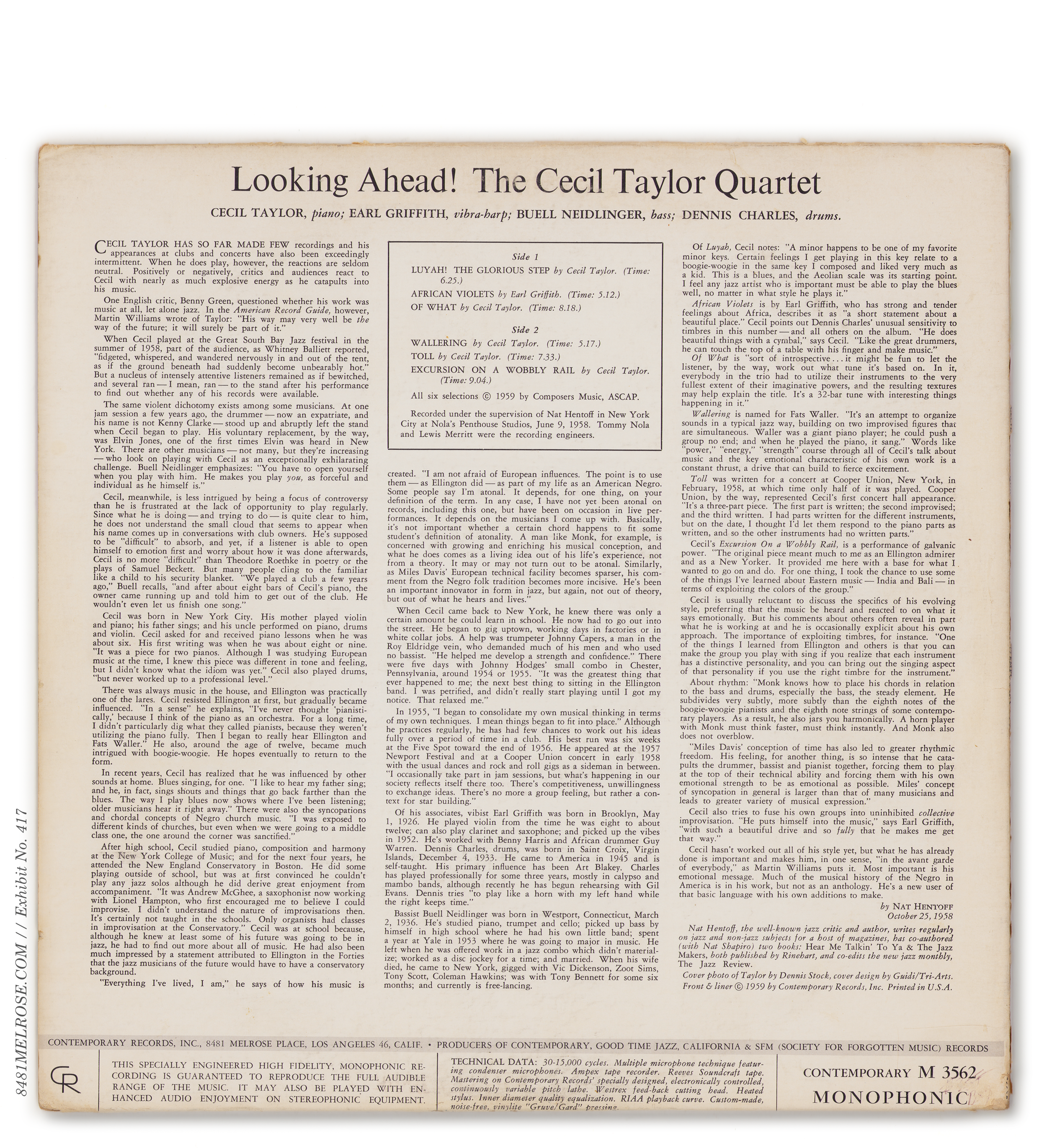


technical header (stereo)

technical footer (mono)
Titles phased into 1st Banner
early mono.
1st banner.
Earlier 3500 titles eventually phased into 1st banner format:
3527, 3530, S7533, M3535, 3543, 3548, M3551, M3558, M3559, 3560.
Timing is not consistent as to when a title might have been phased into this design scheme. Some, like 3521, 3527, 3543, and 3548 had both mono and stereo variants phased into the banner format in 1959/60 (as seen in Modern Jazz Catalog 10). Other titles took quite a bit longer.
The stereo banner Way Out West jacket, for example, was not available until the late 1960s, even though the mono banner variant was delivered a half-decade earlier. And the Peter Gunn stereo banner jacket (S7560) wasn’t seen until the early 1970s, when the title finally shed its Stereo Records S7025 wrapper.
We simply cannot generalize across titles.


Titles phased into 2nd Banner
Not many titles were phased/reissued/reprinted into the 2nd banner scheme. Many early mono/Stereo Records titles had already been translated to 1st banner (and in released in that form on the mono side at least) and thus didn’t need additional designwork at this time.
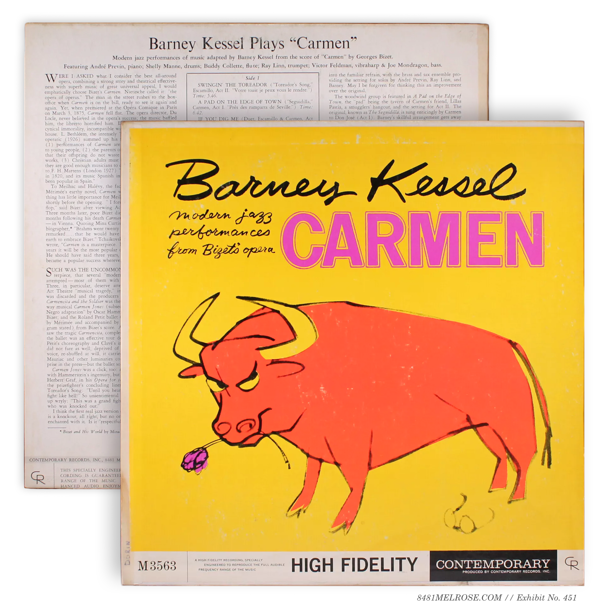
That said, there were a handful of bizarre redesigns from 1st Banner to 2nd Banner. In the case of 3563 Carmen, the change included typography and layout tweaks, while 3570 King Size just swapped the banner to give that lion a little footroom:
M3563 (1959)
M3563 (early 60s)
M3570 (1959)
M3570 (early 60s)
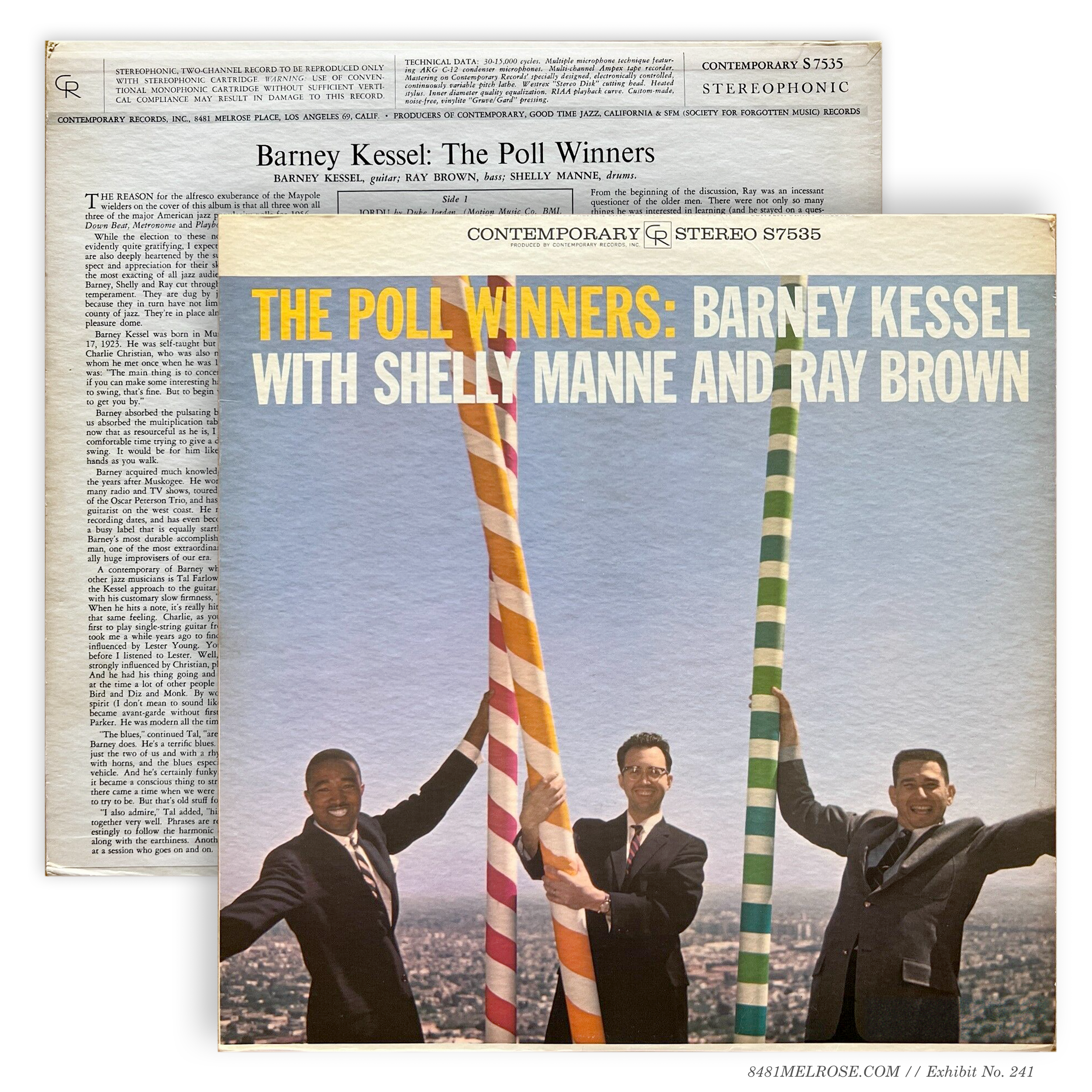
M3535 (early 60s)
S7535 (late 60s)


Titles phased into Bannerless
When mono variants were taken out of print post-1966, stereo reissue jackets were freed of any hybrid responsibility to the extinct format. So while new titles were being designed Bannerless jackets with condensed company branding, several catalog titles up for reprint were given the same treatment. Some mono-only titles (like C3515 This Is Hampton Hawes, in the grid below) were also subject to this translation… for whatever reason.
Top Corner Stereo & Mono Emulation
This was a subtle but significant subcategory within these reissues. Some catalog titles, rather than inserting a condensed company block, replicated pre-1959 mono layouts with Contemporary branding typographically incorporated in the art. Some of these let stereo go unannounced, though several added a polite STEREO reminder in the top right corner.
Mixed jackets
As these Bannerless redesigns were being rolled out, most titles entered an in-between state of manufacture: new back, old front. The technical header was removed and new rear prints made with the 90069 address, but these titles continued using banner stereo fronts.
Banner —> Mixed —> Bannerless
It’s possible these Mixed jackets were a specific experiment to change just one side of the package rather than reinventing both the wheel and the tire. Personally I prefer to think these were transitional products to use up print inventory before phasing into bannerless front art.
I don’t think we can confirm either way, but it’s worth noting that most titles in mixed jackets were indeed phased into full bannerless design.


Older titles touched by full-color.
An exclusive group of titles were re-colored in this era to take advantage of full-color liner notes. Among them, naturally, were the two Contemporary show pieces Way Out West and Art Pepper Meets the Rhythm Section.
2) jacket construction
FRONT-WRAP TIP-ON
(new titles 1955-1959)


REAR-WRAP TIP-ON
(new titles 1959-1963)


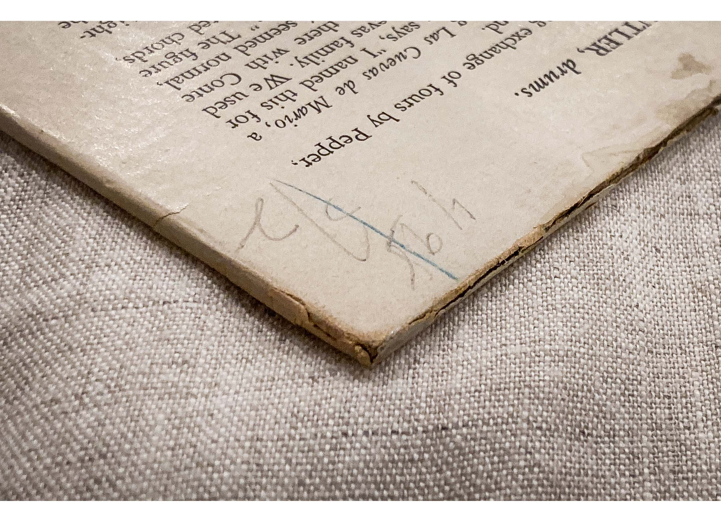
FRONT-WRAP TIP-ON
(new titles 1963-1979)
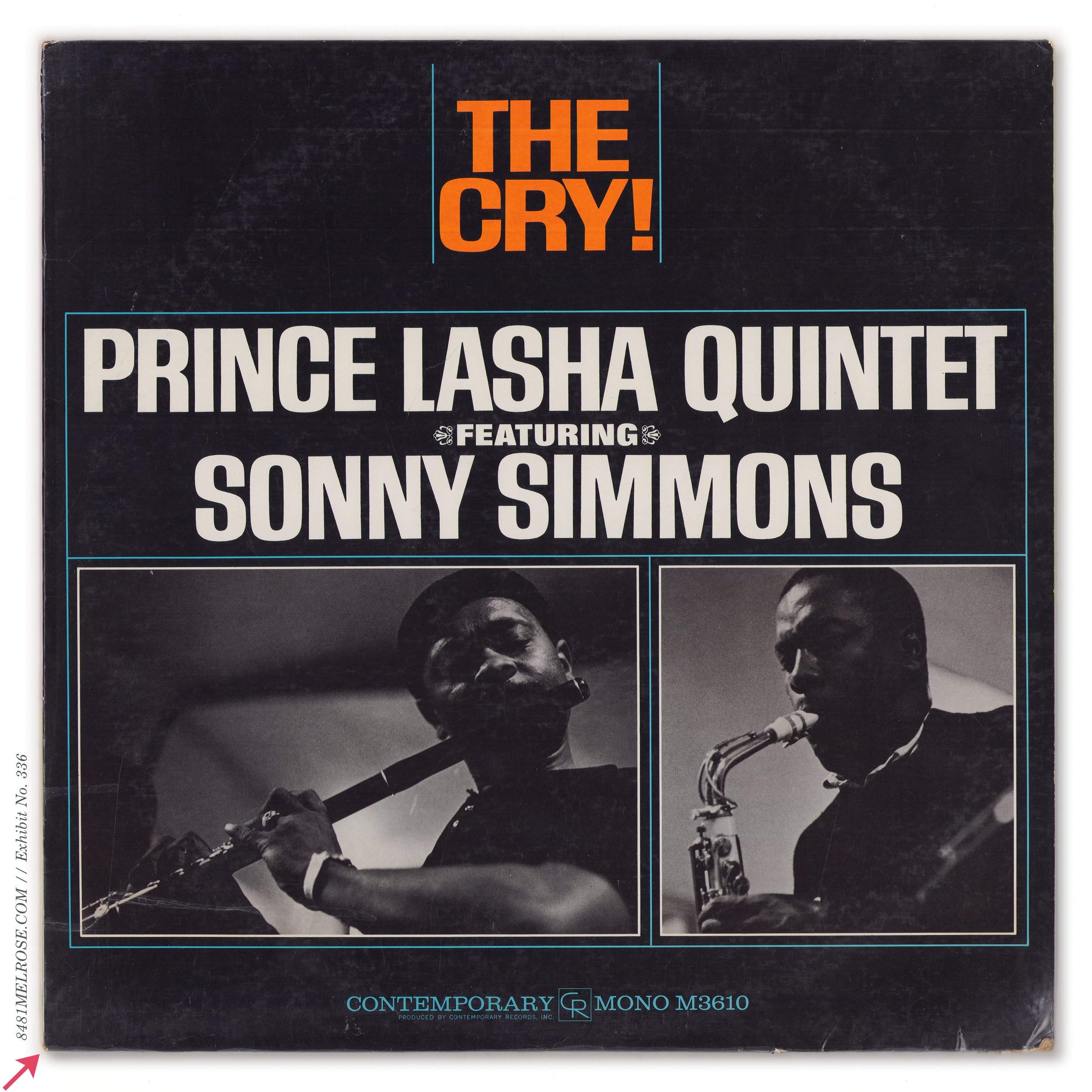


DIRECT-TO-BOARD
(new titles 1979-1982)


Double Gakubushi (≤1955)
The earliest Contemporary LP jackets (including the 10” LPs from 1953-54) had Gakubushi strips on both top AND bottom seams. I’ll call this Double Gakubushi and it can isolate a jacket’s construction to 1955 or earlier.

Single Gakubushi (1955-1960)
Soon construction was revised, and the blank was assembled with a strip on just one seam. Depending on the final assembler’s choice, this strip could end up as top OR bottom seam of the finished jacket.


